 DataViz Kit
  Guide
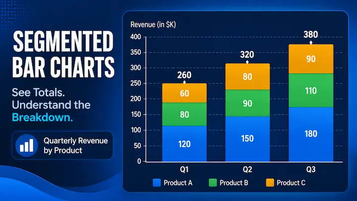
GuideSegmented Bar Chart: What It Is and How to Make One
A segmented bar chart splits each bar into colored sections to show totals and breakdowns at once. See when to use one and make yours free with DataViz Kit.
Read MoreExpert tips, tutorials, and best practices for creating effective and beautiful data visualizations.
GuideA segmented bar chart splits each bar into colored sections to show totals and breakdowns at once. See when to use one and make yours free with DataViz Kit.
Read More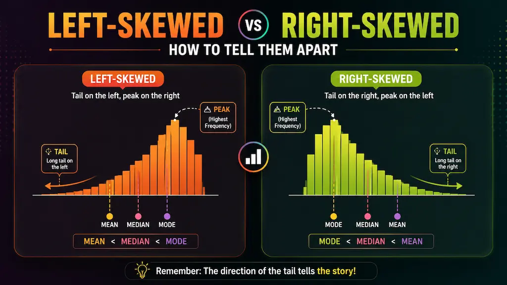 Guide
GuideNot sure which way your histogram is skewed? Use this quick two-step method to check the tail, compare the mean and median, and tell left skew from right skew in seconds.
Read More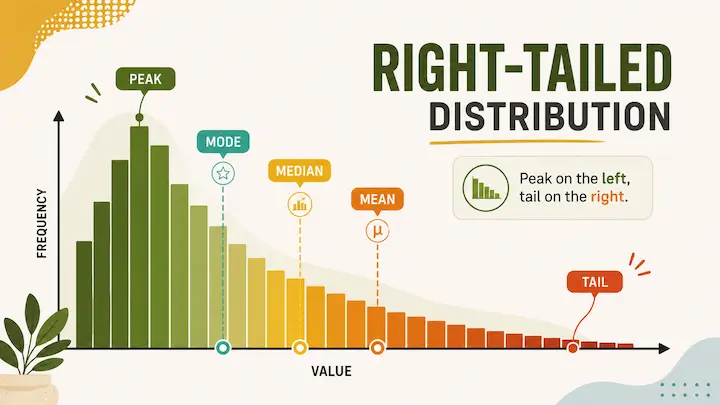 Guide
GuideMost bars bunch up on the left, with a long tail stretching right. See what positive skew looks like, why the mean beats the median, and how to spot a right-skewed histogram fast.
Read More Guide
GuideSee what a left-skewed histogram looks like, why the tail points left even though most data sits on the right, and how to spot negative skew fast.
Read More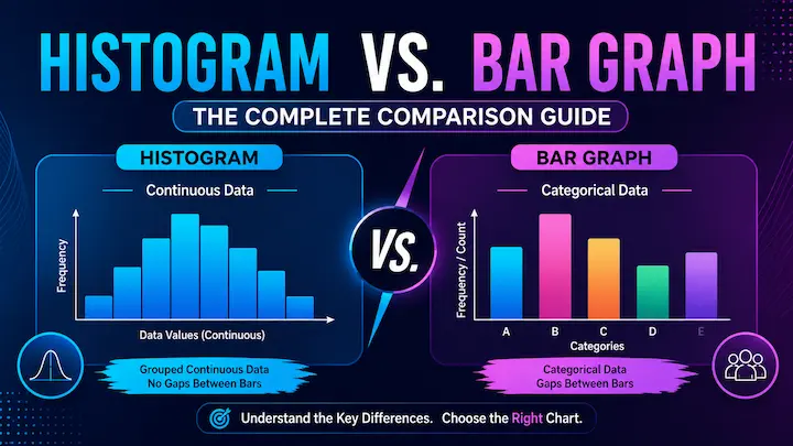 Guide
GuideA histogram and a bar graph aren't the same thing. See the real differences, when to use each, and try our free chart tools to build your own.
Read More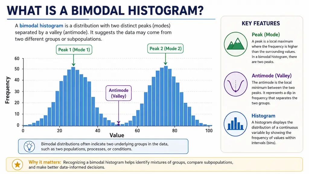 Guide
GuideTwo peaks in your histogram are not a mistake. Learn what a bimodal distribution means, what causes it, and why averaging that data gives you a number that represents nobody.
Read More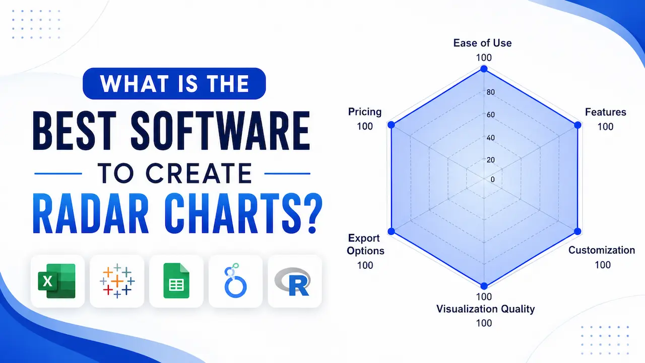 Guide
GuideDiscover the top tools for creating effective radar charts, complete with features, pros, and cons for each option.
Read More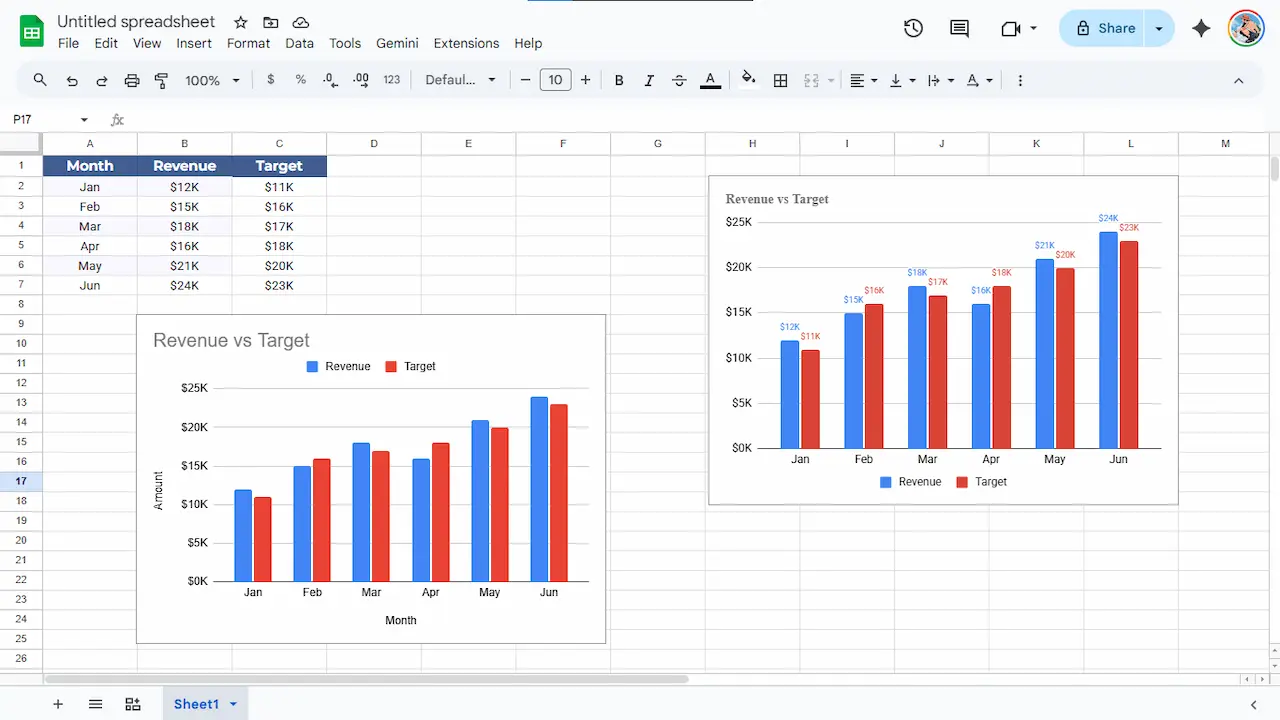 Tutorial
Turn your Google Sheets data into clean, polished charts with formatting tips, export tricks, and design choices that hold up on a real screen.
Read More Guide
GuideA plain-English guide to Data Visualization Consultants. See how these experts swap confusing spreadsheets for clear charts, giving you a better view of your business without the headache.
Read More Best Practices
Fix bad charts with our simple guide. We show you five common mistakes and easy ways to make your data clear and helpful right now.
Read More AI & Data
Learn how to turn LLM outputs into clear, meaningful charts with practical examples, simple workflows, and tools that help you bring AI-generated data to life.
Read More Journalism
Explore how interactive charts for journalism give journalists a smart way to hook readers with fast, clear insights that feel fresh and honest.
Read More