You uploaded your data, built the histogram, and now the bars are doing something a little weird. The peak is sitting on the right side, but there is this long, dragging tail pulling all the way to the left. So what is going on?
That shape has a name: a left-skewed histogram. And once you know how to read it, it tells you a lot about your data. Not just what the "average" is, but where the bulk of values cluster, where the extremes are hiding, and whether the mean is even the right number to trust.
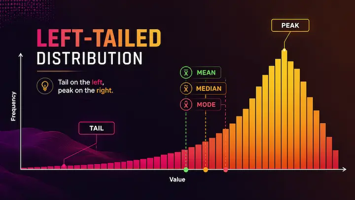
Quick Answer: What Is a Left-Skewed Histogram?
A left-skewed histogram (also called a negatively skewed distribution) has its tail pointing toward the left side, toward lower values. The bulk of the data sits on the right, near higher values. The peak is on the right too.
The mean, median, and mode do not all land in the same spot. In a left-skewed distribution, the order goes like this: mean < median < mode. The mean gets pulled down by those low outliers in the tail, which is why it ends up as the smallest of the three.
What Does "Left-Skewed" Actually Mean?
Here is where a lot of people get tripped up: the name refers to the tail, not the peak.
If you look at a histogram skewed left, the long tail is the part stretching toward the left. But the bulk of the bars, the visual "hump" of the distribution, is actually sitting on the right side. This feels backwards at first. You see more data on the right and still call it left-skewed?
Yes. Because skewness is named for where the tail points, not where the data clusters.
This is also why statisticians call it negative skew. Mathematically, the skewness value comes out as a negative number when the tail drags to the left. It has nothing to do with the data being "bad" or incorrect. It just describes the shape.
Think of it like this: the tail is the rarer, extreme end of your data. Left-skewed means those rare, extreme values are on the low end. Most of your observations are high, a few are notably low, and that pulls the tail leftward.
How to Identify a Histogram Skewed Left
There are two ways to spot left skew: visually and numerically.
The visual method (use when you have the chart)
Look at which side the tail is on. If the bars taper off slowly toward the left, with a longer stretch on that side compared to the right, your histogram is skewed to the left. The bulk of the tall bars should be clustered on the right.
The numeric method (use when you only have summary stats)
Compare the mean and the median. If the mean is smaller than the median, you are likely dealing with left skew. Low outliers in the tail drag the mean downward, while the median stays closer to where most of the data actually sits.
A quick reference: mean < median = left-skewed. Simple as that.
If you want to go further, most statistical tools also report a skewness coefficient. A negative number confirms left skew. How negative? Anything below -0.5 is generally considered moderately skewed, and below -1.0 is strongly skewed.
You can paste your own dataset into our free histogram maker, and the tool will generate the chart instantly, along with live stats including mean, median, and standard deviation. You will be able to see the shape right away without needing to calculate anything manually.
Mean, Median, and Mode in a Left-Skewed Distribution
This is the part that matters most if you are making decisions based on your data.
In a perfectly symmetric distribution, the mean, median, and mode all sit at the same point. Nice and clean. But in a distribution skewed to the left, they separate, and the order is:
Mode > Median > Mean
The mode is the most frequently occurring value, so it sits at the peak, which is on the right. The median is the middle value when all your data is sorted, and it lands slightly left of the mode. The mean gets pulled the furthest left because it is sensitive to every value in the dataset, including those low outliers in the tail.
Why does this matter practically? Because if you report the mean as your "average," it will underrepresent what most people in your dataset actually experienced. The median is usually the more honest number in a left-skewed distribution.
A classic example: if you are analyzing test scores on an extremely easy exam, the mean might be 88 while most students scored 95 or above. A handful of outliers who bombed the test pull the mean down. The median of 94 tells a much better story.
Real-World Examples of Left-Skewed Data
Left skew is less common in everyday datasets than right skew, but it absolutely shows up. Here are a few examples where you would naturally expect a histogram skewed to the left.
Age at retirement. Most people retire somewhere in their 60s. Very few retire early (in their 40s or 50s), and those who do pull the tail to the left. The bulk of the distribution is on the higher end, with the rare early retirees forming a long left tail.
Scores on an easy exam. When a test is too straightforward, most students score near the top. A small number struggle and score low. The result: peak on the right, tail on the left.
Age at death in a healthy, modern population. In countries with good healthcare systems, most people live into their 70s and 80s. Deaths in younger years, while they happen, are rarer events. This pulls the tail to the left.
Machine component lifespans (for high-quality parts). If you are tracking how long a well-manufactured component lasts before failing, most will last close to their designed lifespan. A few fail early due to defects, creating a left tail.
These are not edge cases invented to make a statistics lesson work. This is genuinely what left-skewed data looks like in the real world.
Left-Skewed vs Right-Skewed: Quick Note
It helps to know what left skew is not.
In a right-skewed histogram, the tail points the opposite direction, toward higher values on the right. Income data is the textbook example: most people earn a moderate amount, but a small number of very high earners pull the tail far to the right. The mean > median in that case, instead of the other way around.
The two shapes are essentially mirror images of each other. Left skew = negative skew, tail goes left, mean is lowest. Right skew = positive skew, tail goes right, mean is highest.
For the full breakdown with a side-by-side comparison, examples from both sides, and a quick reference table, the comparison between left-skewed and right-skewed histograms covers all of it in one place.
Common Mistakes People Make With Left-Skewed Histograms
Confusing the tail with the peak. This is the big one. The name "left-skewed" makes people think the data leans left, but actually, the bulk of the data is on the right. The tail is what's on the left. If you remember one thing, remember: skewness = direction of the tail.
Treating skew as a problem. Left-skewed data is not wrong or broken. It is just a shape. It tells you something meaningful about the underlying process generating your data. Trying to "fix" it by removing low outliers without understanding why they exist can lead to worse analysis, not better.
Relying on the mean without checking the shape. In a left-skewed distribution, the mean is pulled down by the tail. Reporting it as "the average" without noting the skew can be genuinely misleading. Always pair a mean with a median when your data might be skewed. If they are far apart, that gap is telling you something.
Assuming left skew is just a flipped version of right skew with no practical difference. The direction of the tail changes, which end holds the outliers, and that has real consequences for how you interpret and report data.
Data visualization mistakes like these are surprisingly common, and they often go unnoticed until someone looks at the actual chart shape. Our article on common bad data visualization patterns and how to fix them walks through several of these in more detail.
Check Your Own Data for Left Skew
The fastest way to know if your data is skewed left is to just look at it. Paste your numbers into our free online histogram maker, and you will get a chart in seconds, along with live statistics including mean, median, and standard deviation. No sign-up, no file uploads to a server, no watermarks.
If you are also working with other types of distributions or need to understand how spread-out your data is, our box plot maker is a great companion tool. Box plots show the median, quartiles, and outliers all at once, which pairs nicely with the histogram when you are doing a deeper data review.