Key Takeaways
- Integrity Matters: Manipulating axes creates a high "Lie Factor," destroying trust in your data.
- Reduce Cognitive Load: Remove "chart junk" like 3D effects, shadows, and unnecessary gridlines.
- Use Sequential Palettes: Color should represent intensity, not just decoration.
- Context is King: Data without annotation is just noise. Always label major events.
Bad data visualization is more than just an aesthetic failure; it is a communication failure. In the world of business intelligence and academic research, a misleading graph can lead to poor financial decisions, skewed policy making, and a complete loss of credibility.
The human brain is wired for visual pattern recognition. According to Gestalt principles of perception, we instantly look for relationships, trends, and outliers. When a chart is poorly designed, it forces the viewer to expend unnecessary mental energy—known as cognitive load—to decipher the meaning. If the load is too high, the message is lost.
In this deep dive, we will analyze the most common errors in quantitative visualization and provide scientific frameworks to fix them.
Mistake #1: The Truncated Y-Axis (The Lie Factor)
The truncated Y-axis is the most common culprit behind misleading graphs in news media and corporate reports. This occurs when the vertical axis does not start at zero, visually exaggerating small differences between data points.
Edward Tufte, a pioneer in data visualization, coined the term "The Lie Factor" to describe this. The Lie Factor is the size of the effect shown in the graphic divided by the size of the effect in the data. If a 5% revenue increase looks like a 50% increase because the axis starts at $95M instead of $0, you are mathematically lying to your audience.
The Fix
For Bar Charts, the baseline must always be zero. The length of the bar encodes the value; cutting the bar destroys this relationship. If you need to show micro-fluctuations (e.g., stock prices), switch to a Line Chart or Dot Plot, where a non-zero axis is acceptable for trend analysis.
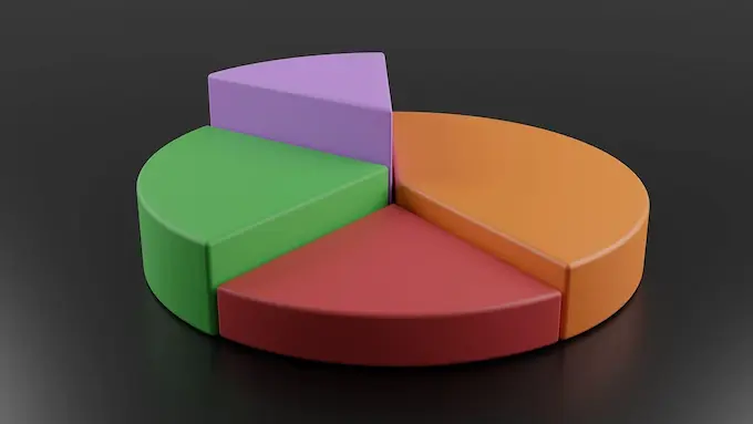
Mistake #2: The Pie Chart Pandemonium
Despite their popularity, pie charts are notoriously difficult for the human brain to process. We are excellent at comparing lengths (bar charts) but poor at comparing angles and areas (pie charts). When a pie chart has too many slices, it becomes a "polychromatic mess" that requires the user to constantly shift focus between the legend and the graphic.
Furthermore, subtle differences—like 24% vs 26%—are almost impossible to distinguish in a circle format.
The Fix
Follow the "Rule of Five." If you have more than 5 categories, do not use a pie chart. Instead, use a Horizontal Bar Chart. This allows for readable labels (no head-tilting required) and precise comparison of values. If you must use a pie chart, group small values into an "Other" category.
Mistake #3: The "Spaghetti Plot" (Line Chart Overload)
A "Spaghetti Plot" occurs when you dump too many data series onto a single Line Graph. Imagine tracking the GDP of 50 different countries on one chart. The result is a tangled mess of intersecting lines where individual trends become indistinguishable.
This violates the principle of visual hierarchy. When everything is emphasized, nothing is emphasized. The viewer cannot identify the "signal" amidst the chaotic "noise."
The Fix
Use Small Multiples (also known as panel charts). Break the one big chart into several smaller charts, one for each category. Alternatively, use a highlighting technique: turn all non-essential lines gray and highlight only the specific line you are discussing in a bold color.
Mistake #4: The 3D Trap (Visual Distortion)
3D charts are often used to make a presentation look "fancy," but they are the enemy of accuracy. 3D effects introduce perspective distortion. A slice of a pie chart at the "front" of a 3D image appears significantly larger than a slice at the back, even if they represent the exact same percentage.
Additionally, 3D bars often create occlusion, where taller bars in the front hide shorter bars in the back, effectively deleting data points from the viewer's sight.
The Fix
Stick to 2D flat design. Prioritize clarity over decoration. As Tufte argues, maximize the Data-Ink Ratio: remove any ink (pixels) that does not convey new information.
Mistake #5: Spurious Correlations & Missing Context
Data visualization is not just about drawing lines; it's about context. A spurious correlation happens when you plot two unrelated datasets (e.g., "Ice cream sales" and "Shark attacks") and they appear to move in sync. Without context, a viewer might incorrectly infer causality.
Another issue is "The Lonely Number." A chart showing that "Sales hit $1M" is useless without a benchmark. Is $1M good? Is it down from last year? Is it below target?
The Fix
Use Annotations. Don't just show the trend line; add text labels pointing to the peak explaining why it happened (e.g., "Black Friday Sale"). Always provide a comparison baseline, such as "Year-over-Year Growth" or "Target Line."
Building Better Visuals with the Right Tools
The easiest way to avoid these errors is to use tools that prioritize best practices in data visualization by default, rather than forcing you to configure complex settings.
We built DataViz Kit to prevent these common mistakes automatically:
- Our Line Graph Maker handles axis scaling intelligently to prevent distortion.
- Our Pie Chart Maker includes limits on slice clutter to ensure readability.
- All tools use accessible, high-contrast color palettes safe for Color Vision Deficiency (CVD).
Conclusion
Great data visualization is about subtraction, not addition. It is the art of removing the 3D effects, the rainbow colors, and the messy legends until only the insight remains. By respecting the cognitive limits of your audience and maintaining data integrity, you turn raw numbers into a compelling, truthful story.