
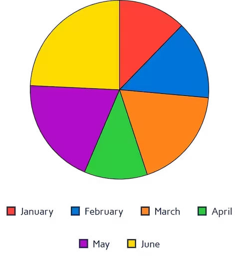

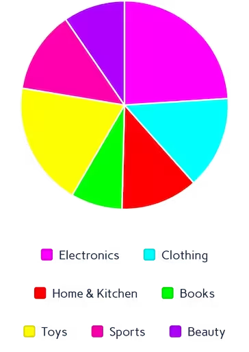
What is a Pie Chart?
A pie chart (often called a circle chart) is a classic statistical graphic divided into slices to illustrate numerical proportion. The arc length of each slice is strictly proportional to the quantity it represents, making it incredibly easy to digest at a glance.
Whether you need a simple visual for a school project or a reliable pie graph maker for business reporting, this tool is built for speed. If you want to create a pie chart online without downloading clunky software, our privacy-first platform processes your data securely right in your browser.
When to Use Pie Charts
- Showing part-to-whole relationships for a small number of categories
- Displaying market share, budget allocation, or survey results
- Creating clean, simple visuals for non-technical audiences
- Presentations where a quick proportional snapshot is needed
When to Avoid Pie Charts
- Showing exact value comparisons — use a bar chart instead
- Displaying small value differences that are hard to read as arc lengths
- Visualizing time-series or sequential data
- More than 6–7 categories (causes visual clutter)
Adding Percentages and Custom Labels
One of the most common requirements for data visualization is clarity. When you make your own pie chart, viewers shouldn't have to guess what each slice represents. That's why our tool automatically calculates the exact mathematical proportions for your dataset.
As a fully custom pie chart maker, the interface allows you to toggle data labels on or off with a single click. This means you can easily use it as a pie chart maker with percentages, ensuring your audience instantly understands the distribution of your data without needing to reference a separate legend.
Key Features of Our Pie Chart Maker
Multi-Source Data Input
- Upload Excel (.xlsx, .xls) or CSV files directly
- Paste data from Excel or Google Sheets with Ctrl+V
- Edit values directly in the interactive data table
Advanced Styling
- 7 professional color palettes with per-slice override pickers
- Optional donut thickness slider (0% = standard pie, 100% = thin ring)
- Interactive legend with per-slice toggle
- Hover tooltips showing exact values and percentages
Export Options
- High-resolution PNG with transparent background
- JPEG for smaller file sizes in presentations
- True vector SVG with slices, legend, and percentage labels
100% Free
- No account or sign-up needed
- Unlimited exports with no watermarks
- Commercial use allowed
Best Practices for Pie Charts
- Limit to 3–5 categories per chart for best readability
- Order slices from largest to smallest starting at 12 o'clock
- Use contrasting colors between adjacent slices
- Include percentage labels so readers don't have to estimate
- Use a legend when slice labels would overlap
How to Make a Pie Chart Online
You don't need advanced spreadsheet skills to build a great visual. Follow these quick steps using our free pie chart generator:
Input Data
- Upload Excel/CSV or paste from clipboard
- Edit the interactive data table directly
- Two columns: Category and Value
Customize Design
- Apply a color preset or pick custom colors per slice
- Add a chart title for context
- Optionally convert to a donut chart with the thickness slider
Interactive Preview
- Hover for exact values and percentages
- Show/hide specific slices via the legend
- Test different color schemes in real time
Export & Share
- Download as high-quality PNG or JPEG
- Export true vector SVG for presentations
Why Choose Our Pie Chart Creator?
- Instant Processing: Render complex charts in under a second
- Smart Calculations: Auto-calculates percentages and totals for every slice
- Client-Side Privacy: Your data is never uploaded or stored on our servers
- True SVG Export: Unlike other tools that export a rasterized canvas, ours generates real vector paths
Complementary Data Visualization Tools
Ready to Create Pie Charts?
Transform your data into compelling visuals with our free pie chart maker. Whether you need to make a pie chart online for a business report or an academic presentation, our tool delivers professional results in seconds.
Explore more data visualization tools in our tool library.