
What is a Bar Graph?
A bar graph (or bar chart) is a widely used visualization that uses rectangular bars to represent quantitative data. The length or height of each bar is directly proportional to the value it represents, allowing for quick comparisons between discrete categories.
Ideal for discrete data, they rank among the most widely used business intelligence tools for quarterly performance reports, survey analysis, and demographic studies (Source).
When to Use a Bar Chart Maker
- Comparing Discrete Categories: Ideal for non-continuous data like sales by region, population by country, or scores by student.
- Ranking Data: "Top 10" lists work best when displayed as bars sorted from highest to lowest.
- Frequency Distributions: Visualizing the frequency count of values in a dataset (similar to a Histogram).
When to Avoid Bar Graphs
- Proportional Data: If you need to show parts of a whole (like market share percentage), a Pie Chart or Donut Chart might be better.
- Complex Trends: For datasets with many time points (e.g., daily stock prices over a year), a Line Graph tracks the trajectory better.
Types of Bar Charts You Can Create
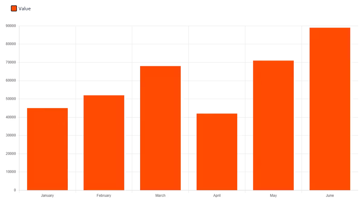
1. Vertical Bar Chart (Column Chart)
The standard format where bars grow upwards. Best for time-series data with few periods (e.g., Annual Revenue 2020–2026) or when category labels are short.
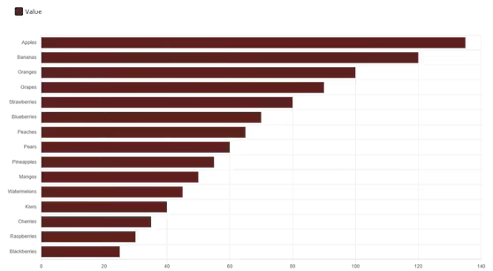
2. Horizontal Bar Chart Maker
Our horizontal bar chart maker lets bars extend from left to right, making it ideal for long category labels and ranked lists. This layout is superior when:
- Category labels are long: Horizontal text is easier to read than rotated vertical text.
- Ranking items: It naturally mimics a list format (e.g., Survey Results).
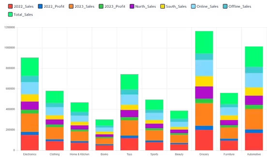
3. Stacked Bar Chart and Percentage Bar Graph
Our bar chart creator supports both standard and percentage-based stacked views:
- Stacked: Divide each bar into sub-segments to show the total value and its composition (Part-to-Whole).
- Percentage bar graph: Normalize each bar to 100% to compare proportions across categories directly.
- Grouped (Clustered): Place bars side-by-side to compare multiple series within the same category.
Key Features of Our Bar Graph Generator
Flexible Data Input
Importing your dataset is seamless. You can paste directly from Excel or Google Sheets, upload CSV/XLSX files, or type values manually into our reactive grid.
Professional Styling
Customize your visualization to match your brand:
- 7 professionally curated color palettes with per-series overrides.
- One-click toggles for vertical or horizontal orientation.
- Instant conversion between standard and stacked layouts.
- Optional chart title rendered on both screen and exports.
- Custom Y-axis min/max for precise scaling.
High-Quality Export
Download your work in formats suitable for any medium:
- PNG — best for reports, slides, and social media.
- JPEG — smaller file size, ideal for presentations.
- SVG (Vector) — best for web design and high-resolution print.
Best Practices for Effective Charts
- Zero Baseline: Always start the Y-axis at 0. Truncating the axis distorts the data and misleads the viewer.
- Logical Ordering: Sort bars by value (High to Low) unless there is a natural order (like age groups or years).
- Consistent Spacing: Keep the gap between bars consistent (typically 50% of the bar width) to maintain visual separation.
How to Make a Bar Chart Online
Input Data
Use our bar graph maker to:
- Upload Excel/CSV files directly
- Paste from Excel or Google Sheets with Ctrl+V
- Type values manually into the data grid
Customize
- Select vertical or horizontal orientation
- Toggle stacked view for multi-series data
- Apply a color theme
- Add a chart title
Refine Details
- Check tooltips for exact values
- Toggle series visibility via the legend
- Set custom Y-axis bounds if needed
Export
Save your chart as:
- Transparent PNG image
- JPEG for presentations
- Scalable Vector Graphic (SVG)
Why Use Our Bar Chart Generator?
Unlike generic online charting tools, our platform is built for speed and privacy:
- Client-Side Processing: Your financial or research data is processed locally in your browser. We never store or view your files.
- Smart Automation: The tool automatically detects data formats and sets appropriate axis ranges.
- Unrestricted Access: Generate unlimited charts without watermarks or account requirements.
Our Other Data Visualization Tools
Ready to Visualize Your Data?
Whether you need a simple graph for a school project or a complex stacked chart for a quarterly report, our tool delivers precise visuals in seconds.
Explore more visualization tools in our complete toolkit.