


What is a Line Graph?
A line graph (often called a line chart) is a foundational data visualization that displays information as a series of data points connected by straight line segments. It is the most effective way to show how values change over time or track continuous data trends.
Whether you need a simple visual for school or a robust line graph generator for business analytics, our platform has you covered. As a privacy-first web application, this line chart creator lets you plot data and visualize trends instantly, all without uploading sensitive information to external servers.
When to Use Line Graphs
- Tracking changes over time (days, months, years, quarters)
- Comparing multiple trends or series simultaneously
- Showing continuous data with many data points
- Visualizing progress toward goals or targets
- Displaying forecasted versus actual results
When to Avoid Line Graphs
- Displaying discrete, unrelated categories — use a bar chart instead
- Showing parts of a whole — use a pie chart
- Visualizing non-sequential or unordered data
- When you have fewer than 3 data points per series
- More than 6–8 series (causes visual clutter)
Handling Multiple Lines & Complex Data
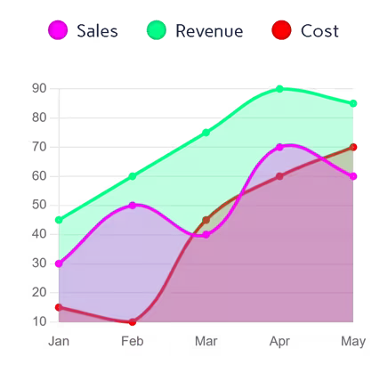
One of the most requested features for any visualization tool is the ability to compare different datasets. Our tool functions as a multiple line graph maker, allowing you to add distinct data series with a single click. By comparing multiple trends on the same axis, you can easily spot correlations or diverging patterns across your categories.
Beyond basic tracking, many professionals look for a reliable linear graph maker or plotter to visualize steady progressions. By structuring your X and Y axes correctly, you can use our interface to map out linear trends or plot straightforward trajectories over time.
Key Features of Our Line Graph Maker
Multi-Source Data Input
- Upload Excel (.xlsx, .xls) or CSV files directly
- Paste data from Excel or Google Sheets with Ctrl+V
- Edit values directly in the interactive data table
- Add multiple series with the + Column button
Advanced Styling
- 7 professional color palettes with per-series override pickers
- Adjustable line thickness, curve smoothing, and point size
- Optional area fill under lines for an area chart effect
- Toggle grid lines and inline data labels on/off
- Custom Y-axis min/max range
Export Options
- High-resolution PNG with transparent background
- JPEG for smaller file sizes in presentations
- True vector SVG with axes, lines, and legend
100% Free
- No account or sign-up needed
- Unlimited exports with no watermarks
- Commercial use allowed
Best Practices for Line Charts
- Limit to 4–6 lines to maintain readability
- Use contrasting colors for different series
- Label axes clearly with units of measurement
- Start the Y-axis at zero to prevent visual distortion
- Use smooth curves only when the data is truly continuous
- Add data point markers when individual values need emphasis
How to Make a Line Graph Online
Wondering how to visualize your data quickly? You don't need complicated spreadsheet software. Just follow these steps using our free tool:
Input Your Data
Launch the line graph plotter by pasting your values directly into the grid. If you are working with large datasets, you can instantly convert your CSV to line graph online by dropping your file into the upload zone.
Customize Design
- Add a chart title for context
- Adjust line thickness, smoothing, and point size
- Toggle fill, grid lines, and data labels
Interactive Preview
- Hover for exact values with tooltips
- Show/hide series via the legend
- Test color schemes in real time
Export & Share
- Download as high-quality PNG or JPEG
- Export true vector SVG for presentations
Why Choose Our Line Chart Creator?
- Instant Processing: Render complex multi-series charts in under a second
- Smart Symbol Detection: Auto-detects currencies, percentages, and units
- Client-Side Privacy: Your data is never uploaded or stored on our servers
- True SVG Export: Generates real vector paths — not a rasterized canvas screenshot
Complementary Data Visualization Tools
Ready to Create Line Graphs?
Transform your data into compelling visuals with our free line graph maker. Whether you need to make a line chart online for a business report or an academic presentation, our tool delivers professional results in seconds.
Explore more data visualization tools in our tool library.