

What is an Area Chart?
An area chart (often referred to as an area graph) is a highly effective data visualization technique used to display quantitative data over a continuous period. Unlike standard line chart, the region below the line is filled with color or shading, which helps emphasize the total volume or magnitude of the data. (For more info).
Whether you need a reliable area graph generator for financial reporting or a quick tool for academic research, our platform is built for clarity and speed. Using this privacy-first area chart creator, you can plot your cumulative data securely in your browser without uploading sensitive metrics to external servers.
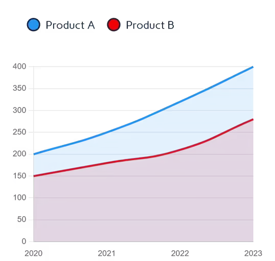
Our area chart maker helps you create perfect visualizations that clearly show how values accumulate over time, making it perfect for tracking progress, identifying patterns, and comparing multiple datasets in a cumulative manner.
When to Use Area Charts
- Visualizing cumulative totals over time
- Showing the composition of a whole
- Comparing multiple categories simultaneously
- Highlighting trends with volume emphasis
- Displaying part-to-whole relationships over time
When to Avoid Area Charts
Per Tableau's visualization guidelines, avoid area graphs when:
- Displaying precise values (use bar charts instead)
- Showing discrete categories without time dimension
- Visualizing data with negative values
- Comparing >5 series (causes visual clutter)
- Needing exact point comparisons
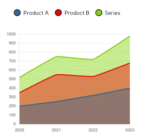
Mastering Stacked Area Visualizations
One of the most requested features by data analysts is the ability to visualize part-to-whole relationships over time. That is where our tool excels as a full-featured stacked area chart maker. By enabling the stacking toggle, you can place multiple data series on top of each other, making it instantly clear how individual categories contribute to the total volume.
When you prepare to create an area plot, it is important to order your data thoughtfully. A standard best practice is to place your most stable, predictable data series at the bottom of the chart, layering the more volatile data on top. This ensures your final visualization is highly readable and mathematically accurate.
Key Features of Our Area Chart Maker
Intelligent Data Processing
- Upload Excel (.xlsx, .xls) or CSV files directly
- Paste data from Excel or Google Sheets with Ctrl+V
- Manual entry with an interactive editable grid
- Auto-detects currency symbols and percentages
Full Visual Control
- 7 professional color presets with per-series overrides
- Adjustable area opacity, line thickness, and smoothness
- Optional chart title that appears on exported files
- Custom Y-axis min/max for precise scaling
- Stacked mode for part-to-whole analysis
Export Options
- PNG (high resolution) with transparent background
- JPEG for smaller file sizes in presentations
- Scalable SVG for crystal-clear, infinitely scalable output
Responsive Design
Our area graph generator works perfectly on all devices:
- Touch-friendly input table editing
- Adaptive chart scaling throughout different devices
- Mobile-optimized layout
Best Practices for Effective Area Graphs
- 4–6 maximum categories for good readability
- Order categories from largest to smallest at the base
- Use precise opacity to show overlapping areas
- Start y-axis at zero to accurately represent proportions
- Consider stacking for cumulative totals
- Use consistent time intervals on the x-axis
How to Make an Area Chart Online
You don't need advanced design software to build professional volume-based visuals. Follow these straightforward steps using our free tool:
Input Your Time-Series Data
- Begin by pasting your dates and values directly into the interactive grid.
- If you are working with large datasets, simply drop a CSV file into the area chart generator to map your data automatically.
Customize Visualization
- Select from 7 professional color themes
- Adjust area opacity for layered visibility
- Toggle between stacked/overlapping views
- Add a chart title and set y-axis bounds
Refine & Validate
- Hover for exact values with interactive tooltips
- Toggle series visibility via interactive legend
Export & Implement
Once finished, you can:
- Download high-quality PNG or JPEG
- Export true Scalable Vector Graphics (SVG)
Why Our Area Chart Creator Stands Out
Unlike other free online tools, our area chart creator stands apart with features designed for professional use:
- Intelligent Data Handling: Automatically recognizes dates, currencies, and percentages without manual setup
- Interactive Visualizations: Hover tooltips for exact values and toggle series via interactive legend
- Privacy First: Your data never leaves your computer. All processing happens locally in your browser
- Publication-Ready Outputs: Export high-resolution PNG, JPEG, and true vector SVG for your projects
- Unrestricted Downloads: Unlimited exports without watermarks or branding
Our Other Data Visualization Tools
Ready to Create Professional Area Charts?
If you need to make an area chart online for academic research or business intelligence dashboards, our area graph maker delivers professional quality visuals in minutes.
Explore more data visualization tools in our data visualization suite.