 DataViz Kit

What is a Scatter Plot?
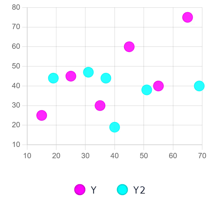
A scatter plot (sometimes called a scatter graph or scatter diagram) is a powerful data visualization that uses dots to represent the values obtained for two different variables. By plotting these points on an X and Y axis, you can easily identify patterns, trends, and correlations within your data.
Whether you need a reliable correlation graph maker for scientific research or a clean visual for a business presentation, our platform gets the job done fast. As a privacy-first scatter chart creator, it processes your data entirely within your browser, ensuring your sensitive metrics never touch an external server.
When to Use Scatter Plots
- Identifying correlations between two continuous variables
- Detecting outliers and anomalies in datasets
- Visualizing the distribution and clustering of data points
- Showing cause-and-effect relationships between variables
- Analyzing patterns in scientific, financial, or research data
When to Avoid Scatter Plots
- Displaying categorical data — use a bar chart instead
- Showing time-series trends — a line graph is clearer
- Working with very large datasets that cause overplotting
- Comparing parts of a whole — use a pie chart
Trendlines and Correlation
When analyzing a dispersion graph, spotting the general direction of your data is just the first step. To truly understand the relationship between your variables, analysts often rely on trendlines to cut through the visual noise.
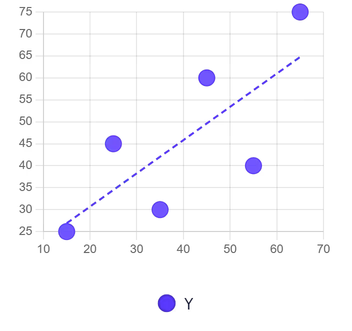
That is why users frequently search for a scatter plot maker with line of best fit functionality. By mapping the linear trajectory of your data points, you can instantly determine if there is a positive, negative, or zero correlation between your X and Y variables, allowing for much more accurate forecasting.
Key Features of Our Scatter Plot Maker
Multi-Source Data Input
- Upload Excel (.xlsx, .xls) or CSV files directly
- Paste data from Excel or Google Sheets with Ctrl+V
- Edit values directly in the interactive data table
- Add multiple series with the + Series button
Advanced Styling
- 7 professional color palettes with per-series override pickers
- 6 point shapes: circle, square, triangle, cross, star, diamond
- Adjustable point size, opacity, and border width
- Optional linear trend line per dataset
- Toggle grid lines and point labels on/off
- Custom X and Y axis range controls
Export Options
- High-resolution PNG with transparent background
- JPEG for smaller file sizes in presentations
- True vector SVG with points, axes, labels, and legend
100% Free
- No account or sign-up needed
- Unlimited exports with no watermarks
- Commercial use allowed
Best Practices for Scatter Plots
- Label both axes clearly with measurement units
- Use appropriate scale intervals to avoid misleading representations
- Add a trend line to make correlations visually explicit
- Use color to differentiate groups or categories
- Avoid overplotting — consider adjusting opacity when many points overlap
- Include a descriptive title that explains the relationship being visualized
How to Create a Scatter Plot Online
You don't need expensive software to visualize your data points effectively. Follow these straightforward steps using our free scatter plot generator:
Input Your Coordinates
- Upload Excel/CSV or paste from clipboard
- Edit the interactive table directly
- Col 1 = label, Col 2 = X, Col 3 = Y; add more pairs for more series
Customize Design
- Set chart, X-axis, and Y-axis titles
- Choose point shape, size, and opacity
- Toggle trend line, grid lines, and point labels
Interactive Preview
- Hover for exact X/Y values with tooltips
- Show/hide series via the legend
- Test different color schemes in real time
Export & Share
- Download as high-quality PNG or JPEG
- Export true vector SVG for presentations
Why Choose Our Scatter Plot Generator?
- Instant Processing: Render complex multi-series plots in under a second
- Trend Line: Auto-calculates linear regression and draws it on the chart
- Client-Side Privacy: Your data is never uploaded or stored on our servers
- True SVG Export: Generates real vector paths — not a rasterized canvas screenshot
Complementary Data Visualization Tools
Ready to Create Scatter Plots?
Transform your data into compelling visuals with our free scatter plot maker. Whether you need to make a scatter plot online for academic research or business analysis, our tool delivers professional results in seconds.
Explore more data visualization tools in our tool library.