 DataViz Kit
What is a Radar Chart?
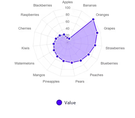
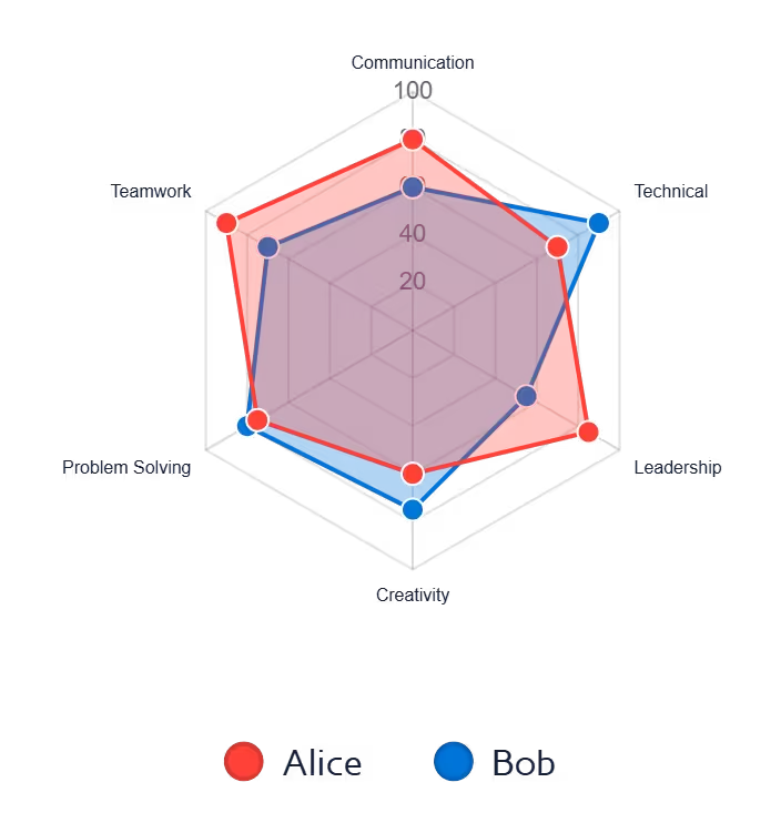
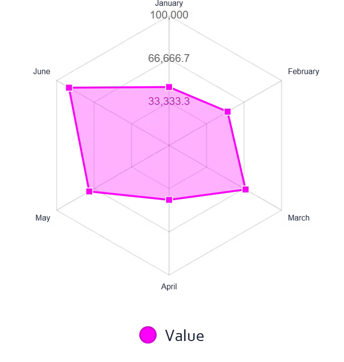
A radar chart (also known as a spider chart, web chart, or polar chart) iis a two-dimensional data visualization designed to display multivariate data. By plotting multiple variables on axes that radiate from a single central point, it creates a distinct polygon shape that makes spotting strengths and weaknesses incredibly intuitive. (Wikipedia).
Our radar chart maker helps you create polished, professional visuals instantly for free — perfect for performance analysis, skills assessments, and competitor comparisons.
When to Use Radar Charts
- Comparing multiple entities across the same set of metrics (e.g. employee reviews)
- Visualizing strengths and weaknesses in a single holistic view
- Displaying multivariate data on a common scale
- Benchmarking performance against a standard or competitor
- Skills assessments, product comparisons, or KPI dashboards
When to Avoid Radar Charts
- More than 6–8 axes (the polygon becomes unreadable)
- When precise value comparisons are needed — use a bar chart instead
- Variables with very different scales (distorts the shape)
- Audiences unfamiliar with this chart type (requires brief explanation)
Skill Assessments and Competitor Analysis
One of the most powerful applications for this visualization is performance benchmarking. Professionals often use our platform as a skill chart creator to map out an individual's proficiencies across various technical or soft skills, making it instantly clear where training is needed.
When conducting a competitor analysis, layering multiple datasets on a single polar chart provides a comprehensive market overview. By assigning different colors and adjusting the fill opacity, you can effortlessly compare multiple brands across identical metrics without the visual clutter of standard bar graphs.
Key Features of Our Radar Chart Maker
Multi-Source Data Input
- Upload Excel (.xlsx, .xls) or CSV files directly
- Paste data from Excel or Google Sheets with Ctrl+V
- Edit values directly in the interactive data table
- Add more axes (rows) or series (columns) with one click
Advanced Styling
- 7 professional color palettes with per-series override pickers
- Adjustable line width, point size, fill opacity, and point shape
- Toggle grid lines, spoke lines, and axis labels independently
- Custom scale min, max, and step size
- Optional chart title rendered on canvas and in all exports
Export Options
- High-resolution PNG with transparent background
- JPEG for smaller file sizes in presentations
- True vector SVG with all polygons, axes, and legend
100% Free
- No account or sign-up needed
- Unlimited exports with no watermarks
- Commercial use allowed
Best Practices for Radar Charts
- Limit to 5–8 axes for best readability
- Use a consistent scale across all axes so the polygon shape is meaningful
- Lower fill opacity (20–40%) when overlaying multiple series so shapes remain visible
- Order axes logically — group related metrics together
- Use contrasting colors for different series so they are easy to distinguish
How to Create a Radar Chart Online
You don't need complex design tools to visualize your multivariate data. Follow these simple steps using our free radar plot creator:
Input Data
- Upload Excel/CSV or paste from clipboard
- Each row = one axis spoke
- Each extra column = one series polygon
Customize Design
- Add a chart title for context
- Adjust line width, fill opacity, and point size
- Toggle grid lines, spokes, and labels
Interactive Preview
- Hover for exact values with tooltips
- Show/hide series via the legend
- Test color presets in real time
Export & Share
- Download as PNG or JPEG
- Export true vector SVG for presentations
Why Choose Our Radar Chart Creator?
- Instant Processing: Render complex multi-series radar charts in under a second
- Full Scale Control: Set custom min, max, and step size for the radial axis
- Client-Side Privacy: Your data is never uploaded or stored on our servers
- True SVG Export: Generates real vector polygon paths — not a rasterized canvas screenshot
Complementary Data Visualization Tools
Ready to Create Radar Charts?
Transform your data into compelling visuals with our free radar chart maker. Whether you need to make a radar chart online for a business report, skills assessment, or academic presentation, our tool delivers professional results in seconds.
Explore more data visualization tools in our tool library.