 DataViz Kit

What is a Donut Chart?
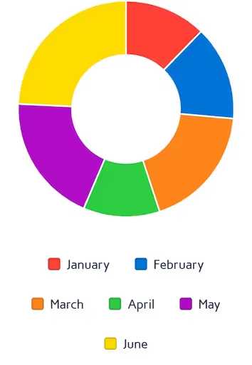
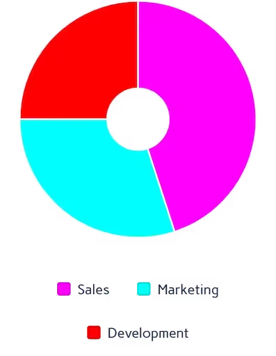
A donut chart (frequently spelled doughnut chart) is essentially a pie chart with a hollow center. This central space is incredibly valuable in data visualization, as it can be used to display a total sum, an average, or a key performance indicator (KPI).
Whether you need a clean visual for a client presentation or an interactive donut chart for your business dashboard, our platform delivers. As a privacy-first tool, all data is processed locally in your browser, allowing you to visualize proportions instantly without uploading sensitive information to external servers.
When to Use Donut Charts
- Showing part-to-whole relationships for a small number of categories
- Displaying progress toward a goal (using the center space for the key metric)
- Creating clean, minimalist dashboard visuals
- Modern presentations where a pie chart feels too traditional
When to Avoid Donut Charts
- Showing exact value comparisons — use a bar chart instead
- Displaying small value differences that are hard to read as arc lengths
- Presenting to audiences unfamiliar with circular charts
- Visualizing time-series or sequential data
- More than 6–7 categories (causes visual clutter)
Donut Chart vs. Pie Chart
Many users search for a donut pie chart maker without realizing the distinct cognitive advantages of the "hollow" design. While standard pie charts force viewers to compare the overall area of solid slices, a donut graph encourages the human eye to compare the length of the outer arcs. This subtle shift makes reading the data significantly easier and faster.
Furthermore, when you generate a donut chart using our tool, you have full control over the inner radius (the hole size). This flexibility lets you create a thick ring for bold emphasis or a thin, elegant ring for modern data reports.
Key Features of Our Donut Chart Maker
Multi-Source Data Input
- Upload Excel (.xlsx, .xls) or CSV files directly
- Paste data from Excel or Google Sheets with Ctrl+V
- Edit values directly in the interactive data table
Advanced Styling
- 7 professional color palettes with per-slice override pickers
- Real-time donut thickness adjustment from 0% (pie) to 100% (ring)
- Interactive legend with per-slice toggle
- Hover tooltips showing exact values and percentages
Export Options
- High-resolution PNG with transparent background
- JPEG for smaller file sizes in presentations
- True vector SVG with slices, legend, and percentage labels
100% Free
- No account or sign-up needed
- Unlimited exports with no watermarks
- Commercial use allowed
Best Practices for Donut Charts
- Limit to 3–5 categories per chart for best readability
- Use consistent color schemes if showing multiple donut charts side-by-side
- Leverage the center space for totals or key metrics
- Maintain sufficient contrast between adjacent slices
- Start the largest slice at the 12 o'clock position for a natural reading order
How to Make a Donut Chart Online
Wondering how to make a donut chart without downloading complex software? Our online donut chart maker simplifies the process into four easy steps:
Input Your Data
Launch the doughnut chart generator by providing your data:
- Upload Excel/CSV files directly into the grid
- Paste data from Excel or Google Sheets with Ctrl+V
- Manually edit the labels and values in the table
Customize Design
- Adjust the central hole size (0–100%)
- Set 0% to convert to a standard pie chart
- Apply a color preset or pick custom colors per slice
Interactive Preview
- Hover for exact values and percentages
- Show/hide specific slices via the legend
- Test different color schemes in real time
Export & Share
- Download as high-quality PNG or JPEG
- Export true vector SVG for presentations
Why Choose Our Donut Chart Creator?
- Instant Processing: Render complex charts in under a second
- Smart Calculations: Auto-calculates percentages and totals for every slice
- Client-Side Privacy: Your data is never uploaded or stored on our servers
- True SVG Export: Unlike other tools that export a rasterized canvas, ours generates real vector paths
Complementary Data Visualization Tools
Ready to Create Donut Charts?
Transform your data into compelling visuals with our free donut chart maker. Whether you need to make a donut chart online for a business report or an academic presentation, our tool delivers professional results in seconds.
Explore more data visualization tools in our tool library.