You have got a histogram in front of you, and it is clearly not symmetric. The bars are not evenly spread out around a center. Something is pulling one way. But which way, and what does it actually mean?
This article is written to answer that in under a minute. No long definitions, no theory detours. Just a fast, reliable method for telling left skew from right skew, a side-by-side comparison of everything that differs between the two, and real examples of each.
The Fastest Way to Tell Them Apart: Two Steps
You do not need a statistics degree for this. Two questions, and you will have your answer.
Step 1: Look at the tail.
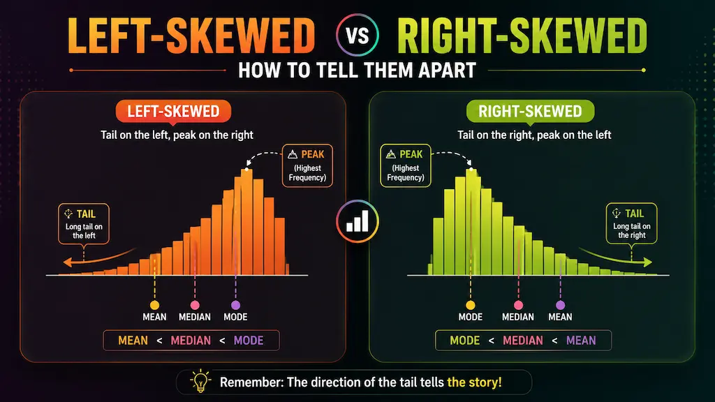
Which side of the histogram has the longer, lower stretch of bars trailing off? That side is where the skew is named for.
- Tail on the left = left-skewed (negative skew)
- Tail on the right = right-skewed (positive skew)
That is it. The tail names the skew.
Step 2: If you only have numbers and no chart, compare the mean and median.
- Mean is smaller than median = left-skewed
- Mean is larger than median = right-skewed
- Mean and median are roughly equal = roughly symmetric
The mean always gets pulled toward the tail because it is sensitive to extreme values. The median stays anchored closer to where most of the data actually sits. So the gap between them, and which direction it goes, tells you which way the tail is pulling.
Look at the Tail: The Visual Method
When you have a histogram in front of you, this is the fastest identification method there is.
The tail is the side where the bars get progressively shorter and more spread out. It is the "thin" end of the distribution. The peak, which is the tallest cluster of bars, sits on the opposite side.
Left-skewed: Peak on the right, tail trailing off to the left. Most of your data is at higher values, with a smaller number of low-value outliers creating that leftward stretch.
Right-skewed: Peak on the left, tail trailing off to the right. Most of your data is at lower values, with a smaller number of high-value outliers pulling the distribution rightward.
The single most common mistake people make is thinking that "left-skewed" means the data leans left, or that more data is on the left side. It does not. The name always refers to where the tail is, not where the bulk of the data sits. Keep that straight, and the rest falls into place.
No Chart? Use the Mean-Median Method
Sometimes you do not have a histogram handy. Maybe you are looking at a summary statistics table, or someone gave you just a mean and a median. You can still make a good call on skew direction.
Here is a simple reference:
| Mean vs Median | Likely Skew | Skewness Coefficient |
|---|---|---|
| Mean < Median | Left-skewed (negative) | Negative number |
| Mean ≈ Median | Roughly symmetric | Near zero |
| Mean > Median | Right-skewed (positive) | Positive number |
The bigger the gap between mean and median relative to the spread of the data, the more pronounced the skew. A small difference might just be noise. A large one is a real signal.
One thing worth noting: this method is a heuristic, not a guarantee. Unusual distributions can sometimes have a mean-median gap that does not perfectly predict the tail direction. When you have the option, always plot the data. The histogram will tell you more than any single pair of numbers.
Side-by-Side Comparison Table
Here is everything that differs between the two shapes in one place.
| Feature | Left-Skewed | Right-Skewed |
|---|---|---|
| Other name | Negative skew | Positive skew |
| Tail direction | Points left (toward lower values) | Points right (toward higher values) |
| Peak position | Right side of the histogram | Left side of the histogram |
| Outlier type | Low-value outliers | High-value outliers |
| Mean vs Median | Mean < Median | Mean > Median |
| Mean vs Mode | Mean < Mode | Mean > Mode |
| Full order | Mean < Median < Mode | Mean > Median > Mode |
| Skewness coefficient | Negative number | Positive number |
| Which average to report | Median (mean is pulled too low) | Median (mean is pulled too high) |
In both cases, the median is the more representative measure of what a "typical" value looks like. The mean gets distorted by whichever tail exists.
Real-World Examples of Each
Left-skewed examples:
Age at retirement is a clean one. Most people retire in their 60s, clustering the data toward higher ages. The rare early retirees in their 40s and 50s form the left tail. Easy exam scores work the same way: most students score near the top, a few score very low, and the distribution peaks on the right with a tail going left.
Age at death in countries with strong healthcare systems also tends to be left-skewed. Most people live into their 70s and 80s; deaths at younger ages, while they happen, are the minority and form the left tail.
For the full breakdown with more examples, see the left-skewed histogram guide.
Right-skewed examples:
Income distribution is the textbook case. Most people earn within a moderate range, but a small number of very high earners stretch the tail far to the right. House prices follow the same pattern. So do customer wait times, website session durations, and hospital length-of-stay data.
The structural reason right skew is so common: many real quantities have a floor at zero but no ceiling. You cannot earn negative income or pay a negative price for a house. But there is no upper limit. That asymmetry naturally produces a right tail.
For more depth on the right-skewed side, the right-skewed histogram guide goes into the log-normal connection and why the mean is especially misleading in these cases.
What If the Histogram Looks Symmetric?
Worth a quick mention since not every distribution is skewed.
If the peak is roughly centered and the tails on both sides are about the same length, you are looking at a roughly symmetric distribution. The normal distribution (the classic bell curve) is the most well-known example. In symmetric distributions, mean, median, and mode all land close to the same point, which is why the mean is a perfectly reasonable summary statistic there.
If your histogram has two separate peaks rather than one, that is a bimodal distribution, which is a different situation entirely. Bimodal data is not really left or right skewed — it suggests there might be two distinct groups mixed together in your dataset, and splitting them might make more sense than summarizing them as one.
Neither of these is a problem. They are just different shapes telling different stories.
Go Deeper or Check Your Own Data
If you want the full treatment on either shape, the individual guides cover the theory, more real-world examples, the mean-median-mode relationship in detail, and common mistakes:
- Left-Skewed Histogram: What It Means and How to Spot One
- Right-Skewed Histogram: What It Means and How to Spot One
To check the shape of your own dataset, paste your numbers into our free histogram maker. It builds the chart in real time, shows mean, median, and standard deviation live, and lets you try different bin counts to see the distribution clearly. No sign-up, no watermarks, everything runs in your browser.