You have probably seen this shape before, even if you did not know what to call it. Most of the bars are bunched up on the left side, tall and close together, and then the chart just... keeps going. A long, low tail stretching out to the right, with a few bars that barely clear the baseline.
That is a right-skewed histogram. And it is honestly one of the most common shapes you will run into when working with real-world data.
Quick Answer: What Is a Right-Skewed Histogram?
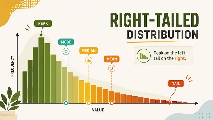
A right-skewed histogram (also called a positively skewed distribution) has its tail pointing toward the right, toward higher values. The bulk of the data clusters on the left side, near the lower values. The peak is on the left too.
The mean, median, and mode do not sit in the same place. In a right-skewed distribution, the order is: mean > median > mode. Those high-value outliers in the right tail pull the mean upward, away from where most of the data actually lives.
What Does "Right-Skewed" Actually Mean?
Same naming logic as left skew, but flipped. The name refers to the tail, not where the data is concentrated.
In a histogram skewed right, the long tail stretches toward the right side, toward higher values. But most of the bars, the tall ones, the bulk of your observations, those are all sitting on the left. So you have a left-heavy chart with a rightward tail.
Statisticians call this positive skew, because the skewness coefficient comes out as a positive number. The more extreme the right tail, the more positive that value gets.
Here is a simple way to picture it. Imagine you survey 1,000 people about their annual income. The vast majority earn somewhere between $30,000 and $80,000. But a handful earn $500,000, $2 million, maybe more. Those few high earners do not move the median much because they are outnumbered. But they absolutely drag the mean upward. The result is a histogram with a big hump on the left and a long, thin tail trailing off to the right.
That is right skew. The tail is rare, but it pulls hard on the mean.
How to Identify a Right-Skewed Histogram
Two ways to spot it, same as with left skew: visual and numeric.
The visual method:
Look at which side the tail is on. If the bars start tall on the left and gradually taper off toward the right, with a longer low stretch on that side, your histogram is skewed to the right. The cluster of tall bars will be on the left.
The numeric method:
Compare the mean and the median. If the mean is larger than the median, you are almost certainly looking at right skew. Those high-value outliers in the tail are inflating the mean while the median stays anchored closer to the middle of the actual data.
Quick rule: mean > median = right-skewed. Flip that, and you have left skew.
For a more precise answer, check the skewness coefficient. A positive value confirms right skew. Values above +0.5 are considered moderately skewed, and above +1.0 is strongly skewed. Most statistical tools, including Python's scipy.stats.skew(), R's skewness(), and Excel's SKEW() function, will calculate this for you instantly.
You can also just paste your data into our free histogram maker and see the shape directly. It calculates mean, median, and standard deviation live as you enter data, so you will know what you are dealing with in seconds.
Mean, Median, and Mode in a Right-Skewed Distribution
This is where right skew has the most practical impact on how you interpret and report data.
In a right-skewed distribution, the three measures of central tendency spread out like this:
Mode < Median < Mean
The mode sits at the peak, which is on the left side of the distribution. The median is the middle value of your sorted dataset, so it lands a bit to the right of the mode. The mean gets pulled the furthest right because it factors in every single data point, including those high-value outliers in the tail.
The practical consequence: the mean overstates what a "typical" value looks like. If you report the mean income of a neighborhood that includes a few millionaires, you will get a number that is higher than what most residents actually earn. The median gives a much more grounded picture.
This is why median household income is the standard measure used by economists and census bureaus rather than mean income. The right skew of income data makes the mean an unreliable representative of the typical person's situation.
Why Right-Skewed Data Is So Common
Right skew does not just pop up occasionally. It is genuinely one of the most frequent distribution shapes in real-world data, and there is a structural reason for that.
Many real-world quantities have a hard lower boundary of zero but no upper limit. You cannot earn negative income. A house cannot cost negative dollars. A customer cannot wait negative minutes. But on the high end? There is no ceiling. Some people earn enormous amounts. Some houses sell for tens of millions. Some customers wait for a very long time.
This natural asymmetry, a floor at zero but an open ceiling, tends to produce right-skewed distributions almost automatically. The bulk of cases cluster near the low-to-moderate range, and a minority of extreme high-end cases stretch the tail outward.
Statisticians often model this kind of data using a log-normal distribution, which is what you get when the logarithm of your variable is normally distributed. If you take the log of income data, for example, it often looks much more symmetric. That is a useful thing to know if you are working with heavily right-skewed datasets and need to apply statistical tests that assume normality.
Real-World Examples of Right-Skewed Histograms
Income distribution. The most cited example, and for good reason. Most workers earn within a moderate range, but a small number of very high earners stretch the distribution far to the right. In the US, the median household income is consistently well below the mean for exactly this reason.
House prices. Similar structure to income. Most homes in a given market sell within a certain range, but luxury properties and outlier sales pull the right tail out significantly.
Customer wait times. In a well-run queue, most customers are served quickly. A few edge cases, system outages, unusual requests, and peak congestion periods create very long waits. The result is a right-skewed wait time distribution.
Hospital length of stay. Most patients are admitted and discharged within a few days. A smaller number of patients with complex conditions stay for weeks or months, pulling the tail right.
Website session duration. Most visitors spend a short time on a page. A few engaged readers or researchers spend a very long time. Classic right skew.
CEO and executive compensation. Even within high-income groups, the distribution is right-skewed. Most executives earn within a band; a handful of top-tier CEOs earn orders of magnitude more.
Left-Skewed vs Right-Skewed: Quick Note
If left skew is the shape you get when low-end outliers are the rare cases, right skew is what happens when high-end outliers are rare. The tail flips. So does the mean-median relationship.
Left skew: mean < median, tail goes left, negative skewness value. Right skew: mean > median, tail goes right, positive skewness value.
For a proper side-by-side breakdown with a comparison table, real examples of each, and a two-step method for identifying which one you have without even looking at a chart, the left-skewed vs right-skewed histogram comparison is the place to go.
Common Mistakes With Right-Skewed Histograms
Using the mean as "the average" without flagging the skew. In right-skewed data, the mean is higher than what most observations actually are. Presenting it as the representative value misleads people. Always report the median alongside the mean, and note when they diverge significantly.
Confusing the tail with the peak again. Still the most common mistake. Right-skewed means the tail is on the right. Most of the data is on the left. The histogram looks left-heavy, not right-heavy. The name refers to the tail.
Thinking right-skewed data needs to be "corrected." Right skew is not an error. It is a real feature of the data. You might apply a log transformation if your statistical method requires normality, but that is a modeling choice, not a fix for broken data.
Comparing means across groups without checking for skew. If group A and group B both have right-skewed distributions, comparing their means can be deceptive. Both means are inflated by their respective tails, and by different amounts. Comparing medians, or using non-parametric statistical tests, often gives a more honest comparison.
These kinds of issues often go unnoticed when people skip the histogram entirely and jump straight to summary statistics. Visualizing your data first is almost always worth the extra minute. Our article on bad data visualization habits and how to avoid them covers several related pitfalls that show up when charts are misread or skipped altogether.
Check If Your Data Is Right-Skewed
The quickest check is to just plot it. Drop your numbers into our histogram maker, and you will see the shape immediately, alongside live mean, median, and standard deviation stats. No account needed, no data sent anywhere, everything runs in your browser.
If you want to go deeper into distribution shape, our box plot maker is a useful companion. It shows the median, interquartile range, and outliers explicitly, which makes it easy to see at a glance how extreme the right tail actually is.