Quick Answer
- A bimodal histogram displays two distinct peaks instead of one central hump.
- The double-peak shape usually means your data is a mix of two completely different subgroups.
- Averaging bimodal data produces a number that typically represents nobody in your dataset.
- Always check your bin sizes before concluding your data is truly bimodal.
You ran your numbers and plotted a chart. But instead of one nice smooth hill, you see two distinct humps. Your graph basically looks like a camel's back. A bimodal histogram pops up when your data has two separate peaks. It can be a little confusing at first glance.
We are going to break down exactly what this means for your numbers. We will look at what causes these double peaks to show up in the real world. We will also talk about how to handle this kind of data properly. Sometimes it is a genuine trend, but other times it is just a formatting trick.
By the end of this guide, you will know exactly how to read these charts. You will stop calculating useless averages. You will also see why checking your bin sizes is the most important step before you present your findings.
What Does "Bimodal" Actually Mean?
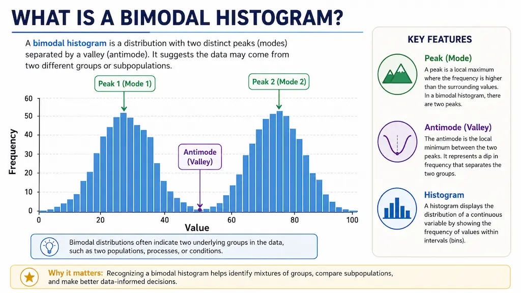
A mode is simply the most frequent value or range in your dataset. When a chart has just one peak, we call it unimodal. A bimodal shape has exactly two distinct peaks. Sometimes you might even see a multimodal chart with many peaks scattered around.
You might also spot a trimodal chart with three distinct peaks, though that is pretty rare. The low valley right between the two peaks actually has a technical name. It is called the antimode. This deep dip is a great sign that your data splits into two distinct groups.
Finding that antimode is critical for data analysis. It marks the exact dividing line between your two separate populations.
What Does a Bimodal Histogram Look Like?
People often ask what does a bimodal histogram look like in the wild. Imagine two separate mountains sitting side by side on a flat plain. You will see a clear cluster of tall bars on the left side.
Then you will notice a valley of short bars in the middle. Finally, another cluster of tall bars rises up on the right.
The middle valley is just as important as the peaks themselves. It proves that the values in the middle are actually quite rare. You can easily spot this shape by dropping your raw numbers into our free Histogram Maker. The tool will automatically group your data so you can see the humps clearly.
What Causes a Bimodal Distribution?
The most common cause is simply mixing two different populations together. The bimodal distribution histogram shape reveals that the hidden mix perfectly. Let us say you measure the heights of adults in a massive group. Men and women generally have different average heights.
Your chart will show one distinct peak for the women and another distinct peak for the men. Restaurant foot traffic is another perfect example of this behavior. You get a massive spike during the hectic lunch rush. Then things die down to a crawl in the afternoon. Later on, you get another massive spike for the evening dinner rush.
Exam scores often do this when a class has two distinct ability levels. A very difficult test might split the class into one group that struggled and another that excelled. You might see customer ages split into two groups if a product appeals strongly to teenagers and also to retirees. Sometimes this double-peak shape also happens if you accidentally merge spreadsheet data from two totally different time periods.
Bimodal vs Unimodal Histogram: Key Differences
It helps to compare a unimodal vs bimodal histogram side by side. Knowing whether your histogram is unimodal or bimodal completely changes how you analyze your dataset.
| Feature | Unimodal Histogram | Bimodal Histogram |
|---|---|---|
| Number of Peaks | One single peak | Two distinct peaks |
| What It Indicates | A single uniform population | A mix of two different subgroups |
| Real-World Example | Adult male heights | Mixed male and female heights |
| Where the Average Is | Usually near the center peak | Usually falls in the empty valley |
Why You Shouldn't Just Average Bimodal Data
This is the biggest trap people fall into. When you calculate the average of a bimodal dataset, the resulting number is usually totally useless. The mean almost always falls right into the antimode dip. That means your "average" represents absolutely nobody in your entire dataset.
Imagine that restaurant traffic example again. The average busy time might be calculated to 3:00 PM. But 3:00 PM is actually the deadest hour of the entire day. Planning your staff shifts around that average would be a total disaster. According to resources like the NIST Engineering Statistics Handbook, finding an average across mixed populations masks the actual reality of your numbers.
You should always split your data into two separate groups first. Analyze the lunch rush on its own. Then analyze the dinner rush on its own. Segmentation is the only way to get real insights.
Pro Tip
When you spot a bimodal shape, identify the antimode first. That valley point is your natural split line. Divide your dataset there and run separate analyses on each group for accurate, actionable numbers.
Is It Really Bimodal, or Just Bin Size?
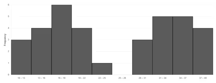
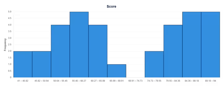
Sometimes your data plays visual tricks on you. The width of your columns can totally change the shape of your chart. Too-narrow bins can create tiny false bumps that look like extra peaks. This makes a perfectly normal dataset look completely wild and random.
Too-wide bins will squash everything together. That will hide a genuine double peak entirely, making it look like a single fat block. You should always play around with the bin width before making big conclusions.
Our tool auto-calculates bins using standard rules like Sturges or Rice. But it also lets you set custom bin numbers manually to check for this exact issue. Adjusting your bins is the best way to verify if your peaks are real. For more on how bin sizing works, check out our guide on the differences between histograms and bar graphs.
Bimodal Histogram Examples
Let us look at a concrete bimodal histogram example to make this crystal clear. We mentioned restaurant traffic earlier. A chart mapping out customer visits by hour will clearly show a peak at 12 PM and another at 7 PM.
Another great example is classroom test scores. A difficult math exam might result in one peak around 60 for students who really struggled. A second peak might form around 85 for the students who studied hard and grasped the concepts.
Seeing these visual examples helps you recognize the pattern in your own daily work. It stops you from making bad assumptions about your audience or your performance metrics.
Can a Box Plot Show Bimodality?
You might wonder if other popular statistical charts show this same double peak. Box plots are actually terrible at catching this specific shape. A box plot completely hides bimodality behind flat lines.
Two wildly different datasets can easily share the exact same median and quartiles. This means a single-peak dataset and a double-peak dataset might produce absolutely identical box plots. This is exactly why a histogram catches what a box plot would completely miss.
If you want to see how these distributions look differently, you can test your numbers on our Box Plot Maker. It is always a smart idea to look at your data in more than one way.
Build & Check Your Own Histogram
If you are staring at a massive spreadsheet and wondering about your data shape, stop guessing. You can visualize it instantly without sending your private files to an outside server.
All processing happens locally, right inside your own web browser. Try pasting your numbers into our Histogram Tool right now. You can adjust the bin sizes, look for double peaks, and even check to see if your data is skewed heavily to the left or the right.