Key Takeaways
- Excel and Google Sheets support radar charts but the default styling is limited
- Tableau and Power BI are powerful but overkill for most single-chart tasks
- Free online tools now match or beat desktop software for everyday radar chart needs
- DataViz Kit's radar chart maker is free, browser-based, and requires no account
- Keep axes between 4 and 8, datasets at 3 or fewer, and normalize values before plotting
Introduction
You have data. Multiple categories, multiple things to compare, and you want it to look good without spending half a day figuring out some clunky software. That is where radar charts come in. And once you start using them, you kind of cannot stop. They are that satisfying to look at.
But which tool do you actually use? If you have searched for the best software to create radar charts, you have probably run into suggestions ranging from Microsoft Excel to full-on enterprise platforms that cost more per month than your gym membership. Some of those tools are great, but a lot of them are overkill for most people.
In this article, we are going to cut through the noise. We will talk about your real options, what makes one tool better than another, and why a free online radar chart maker might be all you ever needed.
What Even Is a Radar Chart?
Before we get into the tools, a quick refresher.
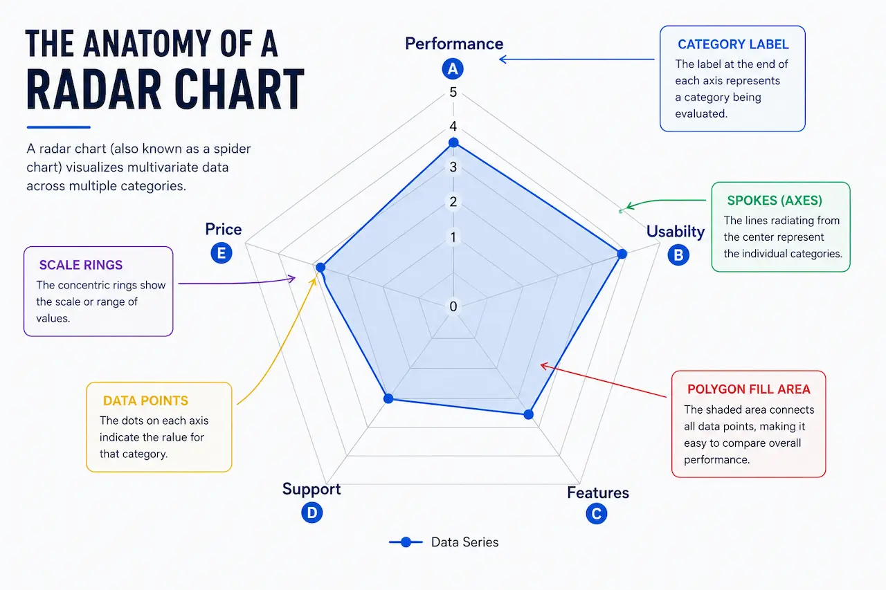
A radar chart also called a spider chart or web chart is a type of graph where multiple variables are plotted on axes that all start from the same central point. The result looks like a spider web (or a radar screen, hence the name). Each axis represents a different category, and the further out a point is, the higher its value.
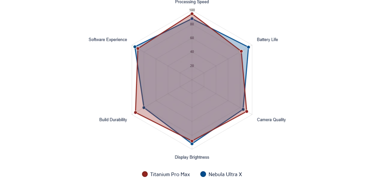
They are great for comparing a few different items across the same set of criteria. Think of a sports comparison: speed, strength, stamina, agility, technique — all on one chart, instantly readable. Or a product evaluation, a skills matrix, a competitor analysis. The use cases are wider than most people expect.
The problem with most chart types is you cannot see the "shape" of something all at once. With a radar chart, you can. That is what makes them useful.
What is the Best Software to Create Radar Charts?
The answer depends on what you need. A data analyst at a large company might have different requirements than a student putting together a presentation. Here is a breakdown of the most common options.
Microsoft Excel and Google Sheets
These are the obvious first choices, and they do support radar charts. Excel has had them for years. But if you have ever tried to make one that actually looks good, you know the struggle. The default styling is, to put it nicely, tragic. Customization is limited, sharing is a whole process, and it is not exactly quick.
Google Sheets is a bit more accessible, but the same issue applies — the visual output feels flat. It works if you just need something functional in a hurry, but for anything you are presenting to someone else, it tends to fall short.
Tableau and Power BI
These are powerful tools. Real, professional-grade data platforms. Tableau is used by major organizations worldwide for data visualization, and Power BI integrates deeply with the Microsoft ecosystem.
But both are expensive, have steep learning curves, and are built for large datasets and complex dashboards. If you just want to make one radar chart for a client presentation or a blog post, using Tableau feels like using a crane to hang a picture frame. You can do it — it is just a lot.
Dedicated Online Radar Chart Generators
This is where things get interesting. Over the past few years, a number of clean, purpose-built online tools have appeared. No installation, no account required, no coding. You open the browser, put your data in, and your chart is done.
Some of these are genuinely excellent. They let you customize colors, labels, fill opacity, scale ranges, and then export your chart as a PNG, JPEG, or SVG. For most people doing everyday data work, these tools are simply the smarter choice.
| Tool | Free | No Account | SVG Export | Multi-dataset | Best For |
|---|---|---|---|---|---|
| DataViz Kit | Yes | Yes | Yes | Yes | Quick, polished charts. No setup |
| Excel | No | Yes | No | Yes | Internal reports, existing Excel users |
| Google Sheets | Yes | No | No | Limited | Quick internal charts, Google Workspace users |
| Tableau | No | No | Yes | Yes | Enterprise dashboards, large datasets |
| Power BI | Partial | No | Partial | Yes | Microsoft ecosystem, complex reporting |
Why Free Online Tools Are Winning
There is a real shift happening in how people think about software. Nobody wants to install things if they do not have to. Nobody wants a 30-day trial that quietly turns into a subscription. And nobody wants to watch a tutorial before they can make a single chart.
Free, browser-based tools have been eating into desktop software territory for years. According to a report by Datawrapper, one of the well-known data visualization platforms, ease of use and accessibility are the two biggest factors people cite when choosing a chart tool. Not features. Not output quality. Just: can I use this without pulling my hair out?
That shift makes a lot of sense. Most chart-making tasks are not that complex. You have some numbers, you want them to look good, and you want to share or download the result. You do not need a platform built for a team of analysts.
Meet DataViz Kit's Radar Chart Maker
DataViz Kit is a free data visualization platform built for people who want clean, good-looking charts without the hassle. No accounts. No subscriptions. No paywalls hidden behind a "basic" plan. Just open it and start making charts.
The Radar Chart Maker on DataViz Kit is one of the tools on the platform, built to be fast, flexible, and actually pleasant to use.
You can enter your data manually using a simple table, or drag and drop a CSV or Excel file directly onto the page. If your data is already sitting in Google Sheets or Excel, you can copy the range and paste it and the tool fills everything in automatically. That alone saves a lot of time.
The chart updates in real time as you enter data, so you always see exactly what you are working with. No clicking "refresh" or waiting for a render.
Customization covers the things that actually matter. You can set a custom scale range (say, 0 to 10 instead of the default 0 to 100), adjust fill opacity so overlapping data series stay visible through each other, change colors for each dataset, add a chart title, and toggle grid lines and labels.
Multi-dataset comparison is built in. Add a new column and you have a second polygon on the chart. This is where radar charts shine — seeing two or three things side by side on the same axes — and the tool handles it cleanly.
When you are done, you can download the chart as a PNG, JPEG, or SVG. The SVG export is a proper vector file, not just a screenshot of the canvas, so you can open it in Figma, Illustrator, or Inkscape and edit it further.
Your data never leaves your browser. Everything runs locally. No server upload, no privacy concerns, even with sensitive business data.
Try the Free Radar Chart Maker
No account. No install. Paste your data and your chart is ready in minutes.
Open Radar Chart MakerHow to Make a Radar Chart in Minutes (No Account Needed)
It really is this simple.
Go to the DataViz Kit Radar Chart Maker. You will see a data table with some sample values already filled in, so you can see how the chart looks straight away. Replace those values with your own data. Change the axis labels in the first column. Add more rows for more axes. Add more columns if you are comparing multiple datasets.
Head to the Customization panel on the right side. Adjust the scale if your numbers are not in the 0 to 100 range. Pick colors. Set fill opacity. Give the chart a title if you need one.
Hit download. Done.
Most people are done in under five minutes. You do not need to watch anything, sign up for anything, or figure out settings that exist purely for enterprise users.
Pro Tip
If your data is in Google Sheets or Excel, just select the range you want to plot, copy it, and paste directly into the DataViz Kit data table. It maps columns and rows automatically.
Tips for Making a Good Radar Chart
The tool matters, but so does how you use it.
Keep the number of axes between four and eight. Below four, the chart looks too simple. Above eight, it starts getting hard to read — the polygons overlap too much and the labels get crowded. That middle range gives you a chart that is both informative and readable.
Keep the number of datasets to three or fewer. You can technically put more on one chart, but at some point it just becomes a colorful mess. If you have four or five datasets, consider splitting them across two charts.
Make sure your axes are actually comparable. This sounds obvious, but it trips people up. All values on a radar chart share the same scale, so if one axis goes from 0 to 100 and another naturally sits between 1 and 5, your chart will look off unless you normalize the values first.
Use fill opacity wisely. If datasets overlap, lower the opacity on each series so both remain visible. The DataViz Kit tool has a slider for this that works well.
Label clearly. A chart without context is just a shape. Add a title. Make sure your axis labels are readable and meaningful.