 DataViz Kit
 A bar chart is a graph that uses rectangular bars to represent data values for different categories. The length or height of each bar is proportional to the value it represents, making it one of the fastest ways to compare data across groups.
Bar charts are probably the most common chart type on the planet. You've seen them in news articles, school textbooks, business presentations, and government reports. They are basically anywhere someone needs to compare things visually. And yet, a lot of people don't realize there are actually several different kinds of bar charts, each built for a slightly different job.
Picking the wrong one doesn't make your data wrong, but it can make it confusing. A chart that takes extra effort to read is a chart that loses its audience.
This guide covers every major bar chart type along with the explanation of what it is, what it's good for, and when to use something else instead. By the end, you'll know exactly which version to reach for based on your data and what you're trying to say with it.
What Is a Bar Chart?
A bar chart represents data using rectangular bars, where each bar corresponds to a category and its length or height represents a value. Categories typically go on one axis (usually the x-axis for vertical charts), and values go on the other (the y-axis).
Bar charts work with categorical data — data that falls into distinct named groups rather than continuous ranges. That's what separates them from histograms, which show the distribution of numerical data split into intervals. If you're not sure about that distinction, the histogram vs bar graph comparison breaks it down clearly.
A few things that define every bar chart:
- Bars start at zero. Truncating the axis at a non-zero value is one of the most common ways charts mislead people because it makes differences look bigger than they are.
- Bar width is uniform. Only the length changes to encode the value. Variable-width bars mean something different (that's a Marimekko chart).
- Gaps between bars. Unlike histograms, bar charts have spaces between bars to signal that the categories are discrete, not continuous.
What Does N Mean on a Bar Graph?
The N on a bar graph stands for the total number of observations (sample size) in that group or dataset. You'll usually see it printed below a bar, in parentheses in the axis label, or in the chart legend — something like "Group A (N = 120)."
It tells you how many data points went into calculating the bar's value. This matters a lot when you're looking at averages, percentages, or survey results. A bar showing "75% agree" means something very different if it's based on N = 8 versus N = 800.
In academic research and statistics, N is almost always reported alongside the chart so readers can assess how reliable the results are. If you see a bar chart without N values and the data involves surveys or samples, that's worth being cautious about.
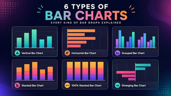
The 6 Main Types of Bar Charts
1. Vertical Bar Chart (Column Chart)
The vertical bar chart, also called a column chart, is the default. Bars run upward from the x-axis, categories sit on the x-axis, and values go up the y-axis.
This is the version most people picture when they hear "bar chart." It works well for comparing values across categories, tracking data over time periods (like months or quarters), and showing ranked data where the differences between bars matter.
Microsoft Excel calls this a "Column Chart" in its interface, which trips people up sometimes. It's the same thing with just Microsoft's naming convention. A column chart is a vertical bar chart.
Best for: Time-based comparisons, category vs. category value comparisons, rankings with a small-to-moderate number of categories.
Avoid when: You have many categories with long names, as the labels on the x-axis will pile up and become unreadable. Flip it horizontal instead.
2. Horizontal Bar Chart
A horizontal bar chart is exactly what it sounds like — the bars run sideways instead of upward. Categories go on the y-axis and values extend along the x-axis.
This isn't just an aesthetic choice. Horizontal bars are genuinely better in specific situations. When your category names are long, the y-axis gives them room to display fully without rotation or truncation. When you have many categories, the chart extends downward naturally instead of squishing everything together. And when you're showing a ranking, readers tend to scan top-to-bottom more naturally than left-to-right.
A horizontal bar chart is often the right call for things like "Top 10 programming languages by usage," "Most popular features by vote count," or any dataset where the category labels are sentences rather than single words.
Best for: Long category names, large numbers of categories, ranked lists, survey response options.
Avoid when: You're showing data over time as time flows left to right by convention, and flipping bars horizontally disrupts that expectation.
3. Grouped Bar Chart (Clustered Bar Chart)
A grouped bar chart — also called a clustered bar chart or side-by-side bar chart — places multiple bars next to each other for each main category. Each bar within a group represents a different sub-category, and the groups are separated by small gaps.
So instead of one bar per category, you get a cluster of bars. If you're comparing sales across three product lines over four quarters, you'd have four groups (one per quarter), each containing three bars (one per product).
The big advantage of this layout is that sub-group comparisons are easy. Because the bars in a group all start at zero, your eye can directly measure their relative heights. That's not possible in a stacked chart, where segments float at different heights.
The trade-off: you lose the ability to easily see totals. You see the individual pieces but not how they add up per group.
Best for: Comparing sub-groups directly across categories, showing multiple series without emphasizing totals.
Avoid when: You have more than 4–5 sub-groups per cluster (the bars become too thin and crowded), or when totals matter more than individual values.
4. Stacked Bar Chart (Segmented Bar Chart)
A stacked bar chart, also known as a segmented bar chart or divided bar chart, splits each bar into colored segments, one per sub-category. The segments stack on top of each other, and the full bar height represents the total for that category.
This is the chart that shows you two things at once: the total for each category and how it breaks down. That dual view is its main selling point.
The downside is that only the bottom segment (anchored to zero) is easy to compare across bars. The segments above float at different heights because they start where the previous one ended, making direct comparison harder.
In AP Statistics, segmented bar graphs are standard for displaying conditional distributions of categorical variables. If you need more details on this specific chart type, the segmented bar chart guide covers it thoroughly.
Best for: Showing totals alongside sub-category composition, part-to-whole comparisons across categories.
Avoid when: Precise sub-group comparisons matter more than overall totals.
5. 100% Stacked Bar Chart
The 100% stacked bar chart is a variation of the stacked chart where every bar is normalized to 100%. Each segment shows its sub-category as a percentage of the total, not the raw value. All bars are the same height.
This version removes the total size from the picture entirely. You can't tell which category had more data overall — the chart only shows proportions. That's actually useful when your groups have very different sizes, and you want to compare distributions fairly.
For example, if you survey 50 people in Group A and 500 people in Group B, a standard stacked chart will make Group B's bar dominate just because of its size. The 100% version puts both bars at the same height and shows what percentage of each group chose each answer.
It's also called a normalized bar chart or relative frequency bar chart, especially in statistics textbooks.
Best for: Comparing proportional distributions across groups of different sizes, visualizing relative frequency rather than absolute counts.
Avoid when: Absolute values or totals matter because this chart hides them completely.
6. Diverging Bar Chart
A diverging bar chart is a less common but very useful variant. Instead of all bars starting from zero on the left (or bottom), bars extend in both directions from a central baseline. Positive values go one way, negative values go the other.
This layout is perfect for data that has a natural midpoint or neutral value. Survey responses on a Likert scale ("Strongly Disagree" to "Strongly Agree"), profit/loss by division, or year-over-year growth rates that are sometimes negative — these all work naturally as diverging bar charts.
The central baseline can represent zero, a neutral response, or any meaningful reference point. The visual immediately shows you which categories fall on each side, and by how much.
Best for: Data with positive and negative values, Likert scale survey results, win/loss or profit/loss comparisons.
Avoid when: All your values are positive or all negative — a standard bar chart will be cleaner.
Bar Chart vs Column Chart — Are They the Same?
Yes, essentially. A column chart is just a vertical bar chart. The confusion comes from Microsoft Excel, which uses "Column Chart" in its interface to refer specifically to the vertical version, and "Bar Chart" to refer to the horizontal version.
In most other contexts, including data visualization theory, statistics textbooks, and tools like DataViz Kit, both orientations are just called bar charts. Vertical bar chart and horizontal bar chart are more precise terms if you need to specify orientation.
So if someone sends you a file and says, "make a bar chart," they almost certainly mean a vertical column chart. But now you know there are six other options depending on what the data actually needs.
Bar Chart Examples by Use Case
Sometimes the best way to pick a chart type is to see what real data looks like in each one.
Bar graph analyzing drought patterns: Researchers tracking drought severity across regions over multiple years often use stacked or grouped bar charts. A horizontal bar chart works well when comparing many geographic regions by name. The Palmer Drought Severity Index, used by NOAA to track drought conditions, is often visualized using bar charts precisely because the data is categorical by region and comparable over time.
Sales data: A vertical bar chart showing monthly revenue, or a grouped bar chart showing revenue by product line per quarter. Clean, fast to read.
Survey results: A 100% stacked bar chart works perfectly here, especially when comparing different demographic groups. Each bar represents a group, and the segments show the percentage choosing each answer.
Population comparison: Horizontal bar charts are great for showing population figures across countries or cities, like long category names, many bars, and a natural ranking structure.
Budget by department: A stacked bar chart showing total budget per year, with segments for each department, gives both the year-over-year trend and the departmental mix in one view.
How to Choose the Right Bar Chart Type
Use this table to make the decision quickly:
| Your Goal | Best Bar Chart Type |
|---|---|
| Compare single values across categories | Vertical bar chart (column chart) |
| Compare across categories with long names | Horizontal bar chart |
| Show multiple sub-groups side by side | Grouped (clustered) bar chart |
| Show totals + sub-group composition | Stacked (segmented) bar chart |
| Compare proportions across unequal groups | 100% stacked bar chart |
| Show positive and negative values together | Diverging bar chart |
| Show data over time periods | Vertical bar chart (or line chart) |
| Ranked list with many items | Horizontal bar chart |
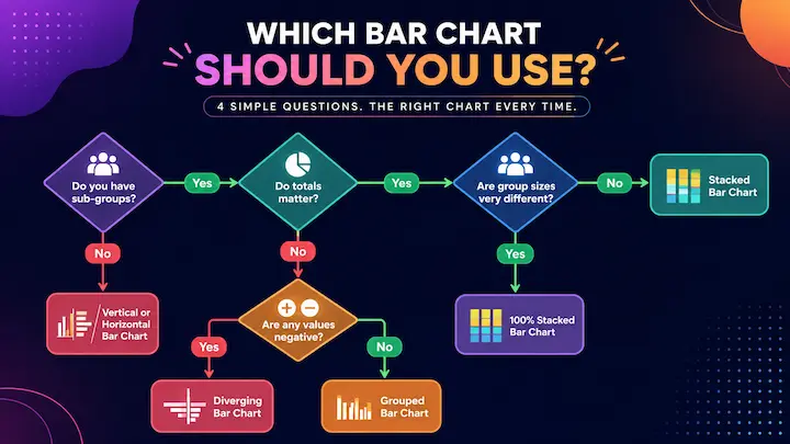
Still unsure? A few questions help narrow it down:
- Do you have sub-groups? If no, use a simple vertical or horizontal bar chart. If yes, ask the next question.
- Do totals matter? If yes, lean toward stacked. If no, lean toward grouped.
- Are your group sizes very different? If yes, consider 100% stacked for fair proportional comparison.
- Are any values negative? If yes, use a diverging bar chart.
Bar Chart vs Histogram — A Quick Summary
People mix these up constantly, but they're different charts for different data types.
A bar chart works with categorical data. The categories are discrete and named. Gaps between bars signal this discreteness.
A histogram works with continuous numerical data divided into intervals (bins). There are no gaps between bars because the data is continuous.
The classic test: if your x-axis has named groups ("North," "South," "East," "West"), it's a bar chart. If your x-axis has numerical ranges ("0–10," "10–20," "20–30"), it's a histogram.
For the full breakdown, including when one performs better than the other, the histogram vs bar graph article covers it in depth.
How to Make Any Bar Chart Type Online For Free
All six bar chart types above are available in DataViz Kit's free Bar Graph Maker. No account, no download, no data uploaded to any server, everything runs in your browser.
Here's how the layout modes work:
Vertical (column chart): The default mode. Enter your categories and values, and you get a standard vertical bar chart instantly.
Horizontal: One toggle switch flips all bars to horizontal. Your data stays exactly the same, with only the orientation changes.
Stacked (segmented): Enter multi-column data (one column per sub-category) and switch to Stacked mode. The tool automatically stacks the segments with color coding and a legend.
Grouped: With multi-column data, switch to Grouped mode for a clustered bar chart where sub-categories appear side by side within each group.
Once your chart looks right, export it as PNG or SVG. SVG is great for presentations and web use since it scales without pixelation.
If you need to turn your chart into a presentation slide, the guide on making presentation charts from Google Sheets shows how to get chart-ready visuals into your slides quickly.
Common Bar Chart Mistakes Worth Avoiding
Truncating the y-axis. Starting the value axis at something other than zero makes small differences look massive. It's one of the most widespread chart mistakes out there. Always start bar charts at zero — if the differences are too small to see that way, a line chart or dot plot might serve you better. The bad data visualization guide covers this and other common errors in detail.
Using 3D bars. Three-dimensional bars look impressive, but distort perception. It becomes genuinely hard to tell which point on a 3D bar aligns with the value axis. Flat 2D bars are always more accurate to read.
Too many categories. Somewhere past 10–12 bars, a bar chart becomes overwhelming. Consider grouping smaller categories into an "Other" bucket, or switching to a table for very long lists.
Wrong chart for the data type. Using a bar chart for continuous data is a histogram mistake. Using a line chart for categorical data is another common one. Match the chart to what the data actually is.
Rainbow colors for no reason. Using a different color for every bar when there's only one data series adds visual noise without adding information. Same-color bars (with one highlighted bar in a different color if needed) are usually cleaner.
Conclusion
Bar charts look simple, but there's a lot packed into that family of charts. Vertical, horizontal, grouped, stacked, 100% stacked, diverging — each one is built for a specific situation, and using the right one makes a real difference in how clearly your data communicates.
The core decision tree is pretty simple: figure out whether you have sub-groups, whether totals matter, whether your values can be negative, and how many categories you're working with. Those four questions narrow it down fast.
If you want to try any of these chart types right now, DataViz Kit's free Bar Graph Maker covers all of them with simple toggle controls and no software, no account, no data ever leaving your browser. Build it, customize it, and export it in a couple of minutes.