
What is a Heatmap?
A heatmap (or heat map) is a powerful data visualization technique that uses color gradients to represent values in a matrix, making complex data patterns instantly understandable. Unlike traditional charts, heatmaps leverage our innate ability to process color variations quickly, allowing rapid identification of trends, outliers, and correlations in large datasets.
According to research from the Nielsen Norman Group, visual representations like heat maps significantly improve data comprehension compared to raw numbers. Our heatmap generator transforms numerical data into intuitive visualizations that reveal insights which might otherwise remain hidden in spreadsheets.
When to Use Heatmaps
- Visualizing correlation matrices in statistical analysis
- Displaying user behavior patterns on websites
- Representing performance metrics across multiple categories and time periods
- Showing geographical data distributions
- Analyzing gene expression data in bioinformatics
- Monitoring system performance across multiple parameters
When to Avoid Heatmaps
- Precise numerical comparisons are required — use a bar graph instead
- Your audience has color vision deficiency — consider the Cividis colorblind-friendly palette
- Displaying categorical data without meaningful numerical values
- Data with very small variations that won't be visible in color gradients
Key Features of Our Heatmap Generator
Flexible Data Input
- Upload Excel (.xlsx, .xls) or CSV files directly
- Paste data from Excel or Google Sheets with Ctrl+V
- Add/remove rows and columns dynamically in the interactive grid
New Customization Options
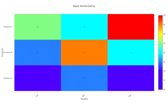
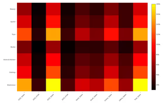
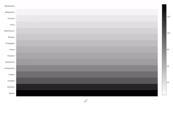
- 9 color scales including Cividis (colorblind-friendly) and Greys
- Custom 3-stop gradient with Low, Mid, High color pickers
- Reverse color scale toggle for inverted emphasis
- Show Values toggle with adjustable font size (8–20px)
- Cell Border toggle — adds a subtle gap between cells for better separation
- Aspect Ratio selector: Auto, Square, Tall, or Wide
- Chart title and X/Y axis labels rendered on both screen and exports
Professional Export
- High-resolution PNG (1200×800px at 2× scale)
- Scalable SVG for presentations and publications
- No watermarks or branding
Best Practices for Effective Heatmaps
- Choose color schemes with intuitive meaning — Viridis for general use, Jet for contrast, Cividis for accessibility
- Use sequential color scales for ordered data and diverging schemes for data with a critical midpoint
- Enable cell borders when rows and columns are visually similar in size
- Add value labels when precise reading of individual cells is important
- Consider the Square aspect ratio for correlation matrices where cells should be equal in size
How to Create a Heatmap Online
Input Your Data
- Upload Excel/CSV or paste from clipboard
- First column = row labels, first row = column headers
- All other cells = numeric values
Customize Visualization
- Select a color scale — or build a custom gradient
- Toggle cell borders and value labels
- Choose an aspect ratio and font size
Refine & Validate
- Hover over cells to see exact values in the tooltip
- Test different color scales for clarity
- Reverse the scale to highlight low values instead of high
Export & Use
- Download high-resolution PNG for reports
- Export SVG for scaling to any size
Why Our Heatmap Creator Stands Out
- Academic-grade color scales: Viridis and Cividis are based on research into human visual perception
- Privacy first: Your data never leaves your browser — all processing is local
- Research-ready outputs: Create visualizations suitable for academic publications
- Zero watermarks: Professional results without branding
- More controls: Cell borders, aspect ratio, font size — not available in most free tools
More Data Visualization Tools
Ready to Create Professional Heatmaps?
Whether you need to make a heat map online for scientific research, business intelligence, or educational purposes, our heatmap graph generator provides enterprise-level capabilities with zero learning curve.
Explore more visualization options in our complete data visualization toolkit.