What is a Gantt Chart?
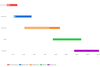
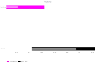
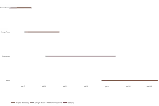
A Gantt chart is a powerful project management visualization that illustrates tasks scheduled over a specific period. It allows teams to see start dates, end dates, and overlapping project phases at a single glance.
Whether you need an easy Gantt chart maker for a quick presentation or a reliable tool to map out complex milestones, our platform is designed for speed. If you want to create a Gantt chart online without installing heavy software, this privacy-first tool processes all your project data securely within your browser.
When to Use Gantt Charts
- Project planning and scheduling complex multi-phase initiatives
- Visualizing task timelines and durations side-by-side
- Tracking progress against planned timelines
- Communicating project status to team members and stakeholders
- Identifying potential bottlenecks before they cause delays
- Resource allocation and workload management
When to Avoid Gantt Charts
According to Lucen Software, Gantt charts may not be ideal when:
- Managing very simple projects with only 2–3 tasks
- Working with highly agile projects requiring constant reprioritization
- Projects have deeply uncertain timelines with frequent changes
- Team members are unfamiliar with how to interpret them
Project Management Best Practices
A project plan is only as good as the data behind it. As a professional Gantt chart builder, this tool helps you focus on what matters: setting clear start and end dates, visualizing task durations, and mapping out milestones. By keeping the interface clean, project managers can easily spot potential bottlenecks before they happen.
For the best results, break your project down into manageable phases. Use our online Gantt chart generator to color-code different teams or task types, making it instantly clear who is responsible for each phase of the schedule.
Key Features of Our Gantt Chart Maker
Intelligent Project Visualization
- Automatic timeline scaling based on your date ranges
- Visual progress indicators as overlays on each bar
- Optional progress percentage labels directly on bars
- Dynamic chart height that grows with the number of tasks
New Customization Controls
- Optional chart title rendered on the exported image
- 4 date tick format options (Month Day, Month Year, ISO, DD/MM/YY)
- Toggle vertical gridlines on or off
- Today Line — an amber dotted vertical line marking the current date
- Show/hide progress % labels on task bars
- 7 color presets with per-task individual color overrides
- Adjustable bar height (0.1–1.0 scale)
Professional Export
- High-resolution PNG exports (1200×800px at 2× scale)
- Scalable SVG format for presentations and printing
- No watermarks or branding on exported charts
Universal Accessibility
- Responsive design adapts to desktop, tablet, and mobile
- Touch-friendly interface for on-the-go project management
- Offline functionality once the page is loaded
Best Practices for Effective Gantt Charts
- Break down projects into manageable tasks (typically 5–20 tasks for clarity)
- Use color coding to categorize tasks by team, priority, or phase
- Include buffer time for unexpected delays in critical path items
- Regularly update the progress column to maintain chart accuracy
- Keep task names short and clear — they appear on the Y-axis
- Use the Today Line to instantly see what is overdue vs on schedule
How to Create a Gantt Chart Online
Building a professional project schedule doesn't require a steep learning curve. Follow these simple steps using our Gantt chart creator:
Input Your Project Data
Get started by adding your project phases into the grid:
- Upload Excel/CSV files directly into the tool
- Paste task data from Google Sheets with Ctrl+V
- Manually edit task names, start dates, and end dates
Customize Your Timeline
- Select a color scheme or set individual task colors
- Add a chart title and choose a date format
- Toggle gridlines, today line, and progress labels
Review and Refine
- Verify task timelines visually against the today line
- Adjust bar height for readability with many tasks
- Share the chart with team members for feedback
Export and Implement
- Download as high-resolution PNG for presentations
- Export as scalable SVG for printing or design tools
Why Our Gantt Chart Creator Stands Out
- No Learning Curve: Intuitive interface requires no specialized training
- Data Security: Your project information never leaves your browser
- Flexible Input: Manual entry, file upload, or clipboard paste
- Professional Output: Presentation-ready visualizations instantly
- More Controls: Today line, date formats, progress labels — not available in most free tools
Other Data Visualization Tools
Ready to Create Gantt Charts Like a Pro?
Whether you need to make a Gantt chart online for a client presentation or create Gantt charts for internal project tracking, our Gantt chart creator delivers professional results in minutes.
Explore more project management visualization tools in our data visualization suite.