
What is a Treemap Chart?
A treemap chart is a highly efficient data visualization method used to display hierarchical, tree-structured data. It uses nested rectangles to represent different categories, where the size and color of each rectangle correlate directly to its numerical value.
Whether you are looking for a reliable treemap tool to map out server storage or a clean online treemap generator for business reports, this platform is built for speed. As a privacy-first web application, you can process your data securely in your browser without needing heavy desktop software.
When to Use Treemap Charts
- Visualizing hierarchical part-to-whole relationships
- Comparing proportions across multiple categories and subcategories simultaneously
- Displaying patterns in large datasets where space is limited
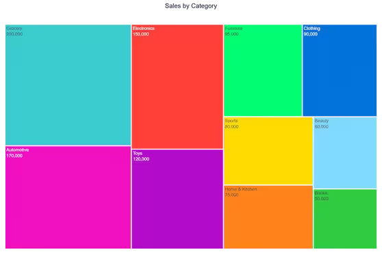
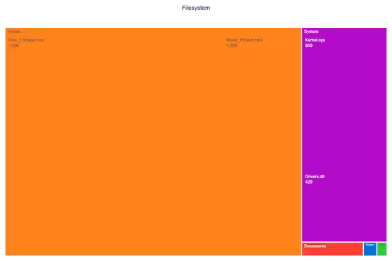
- Showing file system structures, financial portfolios, and organizational hierarchies
- Communicating market share breakdowns across nested categories
When to Avoid Treemaps
- Precise comparisons between non-adjacent rectangles are needed
- More than 3 hierarchy levels (becomes difficult to interpret)
- Dataset contains many small values that become barely visible
- Your audience is unfamiliar with treemap interpretation
- Data contains negative values (sizes cannot be negative)
Portfolios and Hierarchical Data
One of the most powerful use cases for this visualization is financial tracking. Analysts frequently rely on a portfolio treemap visualization to see asset allocation at a glance. By grouping investments by sector and sizing them by market value, you can instantly spot which assets dominate a portfolio.
To get the most out of your tree map chart, it is crucial to structure your parent and child categories logically. Our tool dynamically calculates the proportions of these nested rectangles, ensuring your data hierarchy is both mathematically accurate and visually compelling.
Key Features of Our Treemap Chart Maker
True Hierarchical Support
- Automatic parsing of hierarchical data using / separators
- Color inheritance — child nodes share their parent's color automatically
- Smart value normalization for accurate size representation
New Customization Controls
- 4 layout algorithms: Squarify, Binary, Dice, Slice
- Per-category color pickers with 7 preset palettes
- Label font size slider (8–20px)
- Rectangle padding slider (0–12px) to control spacing between cells
- Max Hierarchy Depth selector — show all levels, or limit to 1, 2, or 3 for cleaner presentation
- Show/hide labels and values independently
- Chart title rendered on export
Professional Export
- High-resolution PNG (1200×800px at 2× scale)
- Scalable SVG for presentations and publications
- No watermarks or branding
How to Structure Your Data
The most important thing to understand about this tool is the / separator. Each row has two columns: Category and Value. The Category column uses forward slashes to define hierarchy depth:
- Electronics — top-level parent node
- Electronics/Computers — child of Electronics
- Electronics/Computers/Laptops — grandchild, three levels deep
Parent nodes should also have their own row with a value — this controls the parent rectangle's size when viewed at the top level. If a parent's value is less than the sum of its children, Plotly will auto-calculate it.
How to Make a Tree Map Online
Wondering how to build this complex visualization quickly? You don't need coding skills or expensive subscriptions. Follow these simple steps using our free treemap creator:
Input Your Hierarchy
- Use / separators for hierarchy depth
- Add parent rows with their own values
- Paste directly from Excel or Google Sheets
Customize Visualization
- Choose a color preset or pick per-category colors
- Select a layout algorithm
- Adjust depth, padding, and font size
Refine & Explore
- Hover for exact values and percentages
- Limit depth to focus on top-level categories
- Click nodes to drill in (Plotly interactive mode)
Export & Use
- Download high-resolution PNG for reports
- Export SVG for print and presentations
Why Our Treemap Creator Stands Out
- True hierarchical support: Native multi-level data without flattening
- More controls: Depth limit, padding, font size — not available in most free tools
- Privacy first: Your data never leaves your browser
- No limitations: Unlimited data points and exports without watermarks
Our Other Data Visualization Tools
Ready to Create Professional Treemap Charts?
Whether you need to make a treemap chart online for business intelligence, academic research, or data journalism, our treemap chart generator provides enterprise-level capabilities with zero learning curve.
Explore more visualization options in our data visualization toolkit.